Follow Me...

       
Thanks for stopping by! Don't forget to subscribe!

Friday, July 27, 2012

Mixed Media Canvas - Dream

2
I decided this week I wanted to walk away from Cut and Paste for a while and get my fingers totally dirty.  I love to create these canvases of the kids in my world and hang them through out my house.

This time though I reached for colors that I barely work with, green, peach, and yellow for the background.  After layers and layers of shimmer sprays, a little brushed corduroy around the edges, a little teal ink over the top,  some stucco, stamped script, masking tape, gesso, a little finger painting, a little drippage, the background was born.  Not much thinking just messy messy goodness. 


For the embellishments my focal point is the roses made from Aluminum cans. I have a video on these on my YouTube channel.   I used the Tim Holtz Tattered Rose and Tattered Pine cone to create them.  I rested them on top of a piece of sheer ribbon with sequin flowers.  Then for more texture I used the Prima Burlap Rose leaves, some were spritzed orange and gold to make them varied.   I added a Prima Cinderella Spray of Crystal flowers, and loved how the texture of the glass complimented the rustic metal.


To make the Prima birds blend a little better with the canvas I decided to alcohol ink them with black soot, patina rub-n-buff, and  then a gold paint on top of that. I did the same technique to the Prima birdcage (minus the Patina). I also patinaed a  metal butterfly and dragon fly charms from Pink Paislee.


I went through my Miscellaneous pile (the one that has a random element here and there left over from previous projects), and added the Prima Cabochon Roses, flower centers, and a random bead spray. I had put together the ornate plate with the ticket dream in it for a previous project and never used it.  Thought it complimented this one perfect so I threw it in. 

I love how all these random things came together.  There are so many textures in this piece that I can literally sit for hours and stare at it. When I walk by I can't help but reach out and touch it.

Thanks for stopping in today. 

Tonya Gibbs


Resources:
8x10 Canvas
Glimmer Mist:   Perfect Peach, Meadow Green, Gold
Prima:  Cinderella Spray, Clock, Cabochon Roses, Sultan Flower Centers, Resin Birds, Metal Birdcage, Burlap leaves, Resin Corner, Chain
Pink Paislee: Dragonfly and Butterfly Charm
Tim Holtz:  Ornate Plate, Adage Ticket, Number Plate, Tattered Rose Die, Tattered Pine cone Die, Brushed Corduroy Distress Ink.
Ranger: Black Archival Ink Black Soot Alcohol Ink
Rub-N-Buff: Patina
Misc: Stucco, Gesso, Ribbon, Gold Sharpie, Script Stamp, Aluminum Cans
Read More »

Tuesday, July 24, 2012

Digi Layout - Brighton Gibbs

0
I thought you guys might enjoy a glimpse into my Photoshop World today. This is a digital layout that created a few months ago of my son Brighton.  The photo was taken back in 2009 in front of  tin wall.


© 2012 Tonya A. Gibbs Photography - All rights are reserved.

This took hours in Photoshop, but I will try and break out a few of the steps for you.

  1. When I go on photo shoots I'm always looking for things to photograph that have lots of texture, color, and patterns. Such as:  Rust, Concrete, walls, plants, wallpaper, grass, etc...Organizing these photos is KEY! I have an external hard drive that I store all of my photos on, I have all these fab textures stored in a folder titled "Stock Photos" and inside that folder by Texture, Pattern, Colors.   This helps me get a better idea at a glance. 
  2. Always start your digi layouts in the 300 dpi resolution and the size of the final printed piece.  I knew I wanted mine to be printed on 8x10 so that I could easily store, share, frame  or even add to a scrapbook page later.
  3. Then the creative process begins, I start with my bottom layer and add a textured image, then just start playing with brushes and blend modes  building layer after layer until I achieve the look I'm after.  
How long does it take for one of these to emerge? Well it is hard to say. Sometimes I limit myself to an hour or two and sometimes days. Just depends on where my mind is at the moment.  I know many of you have art journals that you test out techniques or color combos on. I use photos like this as  a "Digi" art journal.  When creating these pieces, I'm testing out new Photoshop techniques so that I stay on top of the latest trends.   It is an added bonus that I can print them out and share them with my family.

Thanks for stopping in today,

Tonya Gibbs


Read More »

Saturday, July 14, 2012

Oldies But Goodies - Tools From the Past

0
With CHA right around the corner – I know there are going to be heart stopping products that will become must haves.  We will replace yesterday’s must haves with these latest and greatest products.  It is a vicious cycle.  We have a lot of money invested in these tools, and they are still very useful.  I found myself resurrecting a few of them this week, and thought I would share with you how I showed them some love.

1.     Eyelet setting hammer  -  Remember having to BANG BANG BANG your eyelets into your projects.  Then the Crop-a-dile, from We Are Memory Keepers, was released and the hammer was tossed to the side.  Recently, I pulled the little hammer out of hiding and used it to distress a wooden cigar box. 


2.    The Grommet Setter from Making Memories had my toes tingling.  I HAD TO HAVE IT! It was like the coolest thing with the ginormous flower grommets.  I recently pulled it out to set an Eyelet too big for my crop-a-dile.  Also - Now that I'm thinking about it, I may just use it again this week to add a few of those flowers to a canvas. SO FUN.


3.     Dekled Edge Scissors  - GASP – you say.  Well, if used properly, these scissors can be a lot of fun.  I wanted a really tattered edge on an envelope  and decided to use these scissors.  I’ve also used them to cut fun shapes for mixed media projects.


4.     The old old Sizzix Dies remember the ones with crazy frames – no one ever shows them love anymore.  However,  I’ve been going through my stash of dies lately and found some great oldies to include in my mixed media projects and journals.   Example:  This frame was so popular,  but I haven't used it since 2007.  I recently cut some packaging with it, then dry embossed it and used alchol inks to give it new life.


5.     Remember this guy? I never could get this to cut properly. I have hurrled that little tool into the air so many times out of frustration.  I recently used the cutting plates as a stencil to spray interesting patterns on a project in my art journal.    Take your distress applicator tool and use the sides of the stencils to make beautiful borders on your journal pages.


Do you have tools that you have put away and forgotten about?    I challenge you to pull them out and find a new use for them.

Next week I want to explore products of the past that are making their way into my current proejcts.
Thanks for stopping in today,

Tonya
Read More »

Friday, July 13, 2012

Cottage Chic Mini

0
Marion has done it again, her Cottage Chic mini is absolutely gorgeous. I finished mine this week. I wanted to keep mine simple because I want to have plenty of room to write all over the book, and decorate the pages as I fill it. 


In mine - I included a few pages from the Prim Rose mini that were printed on transparencies.  I love how the transparency looks against all of the notebook lines. 


Each of my signatures has 3 sheets. The first sheet is the cover provided in the download, with the journal lines (also provided) printed on the back.  The second is a double sided page of lines I used the ones from the kit, and I also used the filler page from the Prim Rose book with the roses on it for the back. For the third page,  I printed the cover pages a second time. Once the book was bound, I formed interesting pockets from this page by cutting slits in the pages, before gluing them together.


This is one of my favorite pockets.   I had printed my covers on canvas, but didn't like the look after they were printed.  So I decided to use the printed canvas as a pocket liner.  I really love how this mistake turned out to be fab.  It gives a great texture to the book.


Here is a video walk through of my mini.


Want More Inspiration?

Marion shows how she made her covers on Ustream - Click here to watch

Marion - did a Video on YouTube for another method for binding. Click here to watch Marion's Video.

Oh one more thing before you go... Did you hear "Marion & Garett are giving away a color laser printer. Details can be found in her YouTube video linked above.

Can't wait to see your versions of this mini. Please make sure you tag me in Artsy Addicts if you create one.

Thanks for stopping in today,

Tonya Gibbs http://www.psychomoms.com
Read More »

Friday, July 6, 2012

Sunshine - Layout

0
Kenny has always called Brittany his Sunshine.  When I saw the Sunkiss paper line I knew it would be perfect for a layout of Brittany.

This layout has a lot of mixed media techniques. 


First I distressed the Corrugated Chipboard with Paint, and Crackle Medium. Then I dry brushed over that with the Wild Honey distress stain.


I distressed the sunkiss paper around the edges, and layers lots of prima flowers around the layout.

Brittany's graduation photos were perfect since we took them in my garden. 

Notice the flowers match the flowers in the paper.  To do this, I used Prima's Elina Daisy Flowers, then Vivian Eliza Mini daisies.  I sprayed the Vivian Elizas with a Goldenrod colored shimmer spray, and painted the center with a chocolate shimmer spray.  They made the perfect match for this layout.


Thanks for stopping in today,

Tonya Gibbs


Resources:
  • Prima: Eline Daisies, Rose Trim, Sunkiss Paper, Button Vine - Nature's Garden, Vivian Eliza Daisies, Sunkiss Chipboard, Park Bench Shabby Chic Resin, Bird House Shabby Chic Resin, Mask - Brick, 
  • Ranger:  Wild Honey Distress Stain, Crackle Medium, Picket Fence Distress Stain, Baby Blue Paint. 
  • Sizzix:  Tim Holtz Envelope die
  • Buttons
  • Jute Twine
  • Zutter: Corrugated Chipboard
  • Golden: Texture Medium,
  • Glimmer Mists:  Tattered Leather, and Sunflower
  • Lace.


Read More »

Wednesday, July 4, 2012

Once Upon A Spring Time - Cigar Box

0
I guess you could say I've been on a Fairy kick lately.  Graphic 45's Once Upon A Springtime is one of my all time favorite paper collections.   I have been wanting to alter a cigar box with it for a long time now.   This past weekend I finally had the chance.


Graphic 45: Once Upon A Spring Time: Pixie Post and Once Upon A Spring Time, Ranger: Claudine Hellmuth Matt Multi-Medium and Forest Moss Distress Stain, Prima: Rose buds, Mini Roses and Trellus Roses; Tattered Angels:  Gold Glimmer Mist, Mist Fits Glimmer Chalks; Floral Vine; Gelly Roll Clear Star Pen.

The base of the box was painted with the Ranger Forest Moss Stain then I sprayed Gold Glimmer Mist on top so that it has a nice shine to it.  I cut out the book and Fairies from the paper collection and flanked it with some Roses from Prima. Then I fussy Cut Fairies and birds from the paper collection and nestled them into the floral spray.

I love the way this box turned out, and I hope that my friend likes it too.

Thanks for stopping in today,

Tonya

Read More »

Monday, July 2, 2012

Fairy Belle - Canvas

0
Please meet my beautiful niece, Emily. She is the newest addition to the Gibbs clan, born on June 15. She had her first photoshoot with Aunt Tonya last week, and now to drive everyone crazy with project after project.

I decided to create a canvas to hang in my  living room. There are a lot of mixed media techniques used on this canvas.  I wanted it to feel like a woodsy glen.   I used the Fairy Belle paper from Prima as my accent paper. 


The background has several layers of paint, glimmer mist, texture medium, and crackle medium.  I wanted this canvas to sparkle, but maintain a rustic feel. 


Then a cut out all the flowers from the paper collection to add as a base layer to the canvas. They wrap around the outer edge of the canvas. I added a spray of Prima Lilac Rosebuds (many of which I opened and painted the bulb gold, so that they would favor the magnolias in the paper collection.


 Suzanne shared with me some tiny purple Prima flowers that favor baby's breath. They were so delicate and spindly that I thought they made the perfect filler for the rose spray. Then  I sprinkled a few crystal flower spray around, and dusted the entire thing with golden fairy dust (a.k.a. glimmer mist).

I just love how Ms. Emily looks like she is nestled in a garden with Fairies.

I hope you have enjoyed this project. Thanks for stopping in today.

Read More »

Friday, June 29, 2012

April Journal - Marion Smith's Digital Downloads

0

I finally found the time to finish working on my April Journal for Marion's Monthly challenge.  I used her April Digi Downloads that can be found at http://www.apieceofcraft.com.


I decided to Coptic stitch the journal and I love how primiative it made this book look.  I used some of Marion's vintage trinkets on the cover and distressed them with patina rub-n-buff  and Picket Fence Distress Ink  to pop a little color on the cover.   The Tim Holtz word plate says "Live in the Moment" which is perfect for a monthly journal.

It is so awesome to look back at each month and see all of the things that have gone on in my life.

here is a video page by page walk through of the journal:


Thanks for stopping in today,

Tonya Gibbs
http://www.psychomoms.com
Read More »

Friday, June 22, 2012

Fairy Belle - Meet Emily

0
Last week I shared with you my journal entries using my Sister In Law's maternity pictures. Well, Ms. Emily was due on July 11 and she decided on June 15 that she wanted to meet us all. 

Today - I am going to introduce you to the newest member of the Gibbs Clan -  Ms. Emily Jean Cunningham she arrived very healthy at 5lbs and 6oz and 17.5 inches long.  Our little Princess needed a layout fitting of royalty and Prima's Fairy Belle seemed to do the trick.


I took 2 sheets of the Fairy Belle 12x12 Paper -  Le Toulle is the top paper, and La Spa is the back paper.  Now this gets a bit tricky --on the La Spa paper I fussy cut around the top portion of the fairy at the top and used her as a pop out.   On the Le Toulle paper I cut out the center section, and used it as a frame over the La Spa.  Then added some dimensional tape between the two layers. Here are some close up pictures of those sections for a better idea.


Then I took the 6x6 paper and cut the fairies and flowers from it to use as layers around the photos.  I added a few of the Eline daisies from Prima and Pearl Centers. I used a Martha Stewart Punch with some Scrap Prima paper to make the daisy leaves for a little more layer.  Then sprinkled a little fairy dust with my Starlight - Clear Glitter Pin over all the stars and on the Eline flowers.  I know the sparkles don't show well in the photos but the layout has a subtle glimmer sprinkled here and there.

This is a Top view so you can see the dimensions. 


Thanks for stopping in today,

Tonya Gibbs

Resources:
  • Prima:
    • 12x12 Fairy Belle:  Le Toulle and La Spa
    • 6x6 Fairy Belle Paper:  Firefly, Dream, Summer Dream
    • Eline Small Daisies
    • Flat back Pearls
    • Scraps from the Annalee Paper Collection for the leaves.
  • Martha Stewart Crafts
    • Trio Butterfly Punch - used scraps from Fairy Belle paper.
    • Branch Punch - scraps from Annalee Prima Paper Collection
  •  Gelly Roll
    • Black Pen (outlined punched butterflies)
    • Starlight Pen (glitter accents on flowers and printed stars)
  • Lace
  • House of 3  - Digibrush  Precious Moments - Gratitude Brush Set

Read More »

Thursday, June 21, 2012

Reinking - Ranger Distress Pads

0
I have had a few people ask me in the past how to re-ink a stamp pad.  We all know that if you add too much you get a soupy mess.  If you don't add enough -  well - you know!

While I can't speak for all stamp pads (since it is specific to manufactorer standards), I can speak for the Ranger Distress Pads. 

I recently took a class with Tim Holtz and he gave a demonstration on the mystery of how much ink to use and technique for refilling your Distress Inks.

First it is important to understand the ink pads themselves. Dye based ink pads are made of felt that is compressed and then laminated with a fabric topper. The fabric keeps the felt together. The felt helps to "suspend" ink.  Think of a sponge you fill it with water and it appears dry until you press it and the water bubbles to the top.   This is exactly how the ink pads work. The ink is suspended in the pad until the stamp presses it and the ink floats to the top and is applied to the surface of your stamp.  With that said -  the Ink will not absorb into the pad without the pad being pressed.

Here are the simple steps:
Verify that you are using the correct ink for the right pad (you laugh that I say this, but my walnut ink lid was on my tea die pad and let's just say I now have 2 walnut pads).


Second the Ranger Reinker bottles are designed SO THAT THE DROPPER holds the perfect amount of ink needed to reink 1 pad.   Fill the dropper with ink and apply all over the top of the pad as demonstrated below...


Next -   Use an old gift card/credit card and scrape the ink into the pad.  You need to apply pressure, and move down the pad, then across the pad until all the ink is absorbed.  This may take a few minutes and seem hopeless at first! 


This is what your pad will look like when all the ink is absorbed.  Notice there are a few drops of ink around the lid? 


Simply wipe around the perimeter of the pad with a baby wipe or moist paper towel. Return the lid to the top.   Your ink pad is now re-inked.  Tim suggests heavy used pads be re-inked every six months to a year. 


One other helpful hint:

There is a myth that ink pads should be stored face down, so that the ink flows to the top of the pad rather than the bottom.  Since we learned at the beginning of this blog that the ink is suspended inside the pad - we know this myth to be false.  You may store your inks in any direction you like for the type of storage system you have.

Thanks for stopping in today - hope this helps!


Read More »

Friday, June 15, 2012

New Arrival - Smash Entry

0
My Sister in Law is expecting her 3rd child, and Aunt Tonya is so excited.  Babies just have a way of making me all gooshie inside.  Ms. Emily will be niece number 8 for me.  I always joke around and say that I'm a grandmother "In Training".  My goal is to be  "Everything" to all of them.  I want them to beg to come see me.  You just can't spoil them too much.

I noticed a trend that is different from when I was having babies 16 years ago, and that is Pregnancy photos.  When I was pregnant with my kids - I never thought to do these photos, and I wish I had.  Kelly's friend Liberty Nobles photographed her pregnancy photos, and I wanted to make a simple little *Smash Spread.   I recently made Kelly a mini album to store these pictures using Prima's new Sunkiss line.  So I had all these scraps that needed to be used.


Except the flowers - everything on this page was a scrap.  The Rub On, on the left page was a scrap from Daisy Dee and has been in my stash for YEARS!  I took the scraps of the Sunkiss paper and pieced them together to create a lovely background.  Then the tiny little scraps I punched a bunch of butterflies to scatter all over the top of the page.   The New Arrival is an old title transparency that I've had for YEARS from Heidi Swapp. The flowers are Prima's small Eline flowers again - they have been around for a couple of years - and I added buttons in the centers of them.  I used an MFT die to cut small doilies from scrap white paper. Then I cut the doilies in half to border the pictures.  Emily is the new baby's name, and I used an old set of chipboard letters.


On this page, I kept with the same theme, but I used some scraps of lace for the picture border on here. 


I just love how these two pages turned out.  I really loved working with the Prima Sunkiss line, and the fact that they took these pictures in a field of yellow flowers - made it perfect.

Do you *Smash?  I find it rewarding to use my scraps and left over embellishments in my *Smash journals.  It feels so good to being able to purge so much at one time.

Thanks for stopping in today,

Tonya Gibbs
Read More »

Thursday, June 14, 2012

Father's Day Wallet

0
I was out blog hopping yesterday and Heidi Swap had the cutest project on her home page.  She made a cute little Father's Day wallet.  I decided that this wallet would be perfect to include in another mini album, in a pocket on a scrapbook page, or as a gift card holder for my husband.

So here is my version:
I wanted mine to have a "grunge & mixed media" tone so I settled on kraft card stock for my base.  I painted some of the panels with red paint and patina Rub & Buff for some. I pulled out distress stains, distress inks, and archival inks and went to town.  For texture & patterns,   I used the "Ultimate Grunge" Stampendous stamp set from Tim Holtz.  The cool thing is you are only limited by your imagination. I decided I needed a little more pop, so I added black magic paint (metallic black) from Folk Art to packing bubble wrap and used that as a stamp. I sprinkled a few tiny quotes and elements as embellishments, and sewed buttons to flaps for a closure.


This view shows the flap opened - I used my Dymo Press Label maker to type this quote "A Dad Puts Pictures Where His Money Used to Be."


On this view you can see how the wallet starts to open  - I used my Pink Paislee Daily Junque stamps to create a small pocket.   The photo is my Daughter, Brittany, in her High School play - The Little Mermaid.


In this view, you can see that I added pictures of my husband with each of our children.  I tried to include memorable pictures from this past year throughout the wallet.


I even included a picture of our dog, Angel who has been in the family for 12 years.   This view is the wallet completely opened.  It is  fun to see the changes in our children in just a few months time.  I placed Tim Holtz Tissue on all of the creases on the inside (make sure you glue under the tissue tape so it stays down), and then stitched over the top of that with my sewing machine.


This is a view of the back of the wallet. 


So how do you make it?
I have a video that explains everything...


Thanks for stopping in today,
Read More »

Friday, June 8, 2012

Overcoming A Creative Rut

0
I've been in a scrappy rut lately. Seems like everything is starting to look the same.  So I decided to create a self challenge to snap me out of it. 

My Mission - Use supplies that are new, use something old, try new techniques, and Don't CLUTTER IT UP!  That last one was a real challenge cause I like LOTS of stuff!  I want to play with a product that I've never used. The Prima Resist pieces, and Prima Canvas Tape were my new products. I've used the resist pieces before in other layouts - but I've never colored them. I also pulled out my Timmy Distress Markers, and decided to use them (they are like new - rarely use them).
I made this layout with photos of my two lovely nieces Averie and Addie.  (You will see lots of posts with the pics from this photo shoot.)


I outlined the resist pieces with the Timmy Distress Markers then used Glimmer Mists instead of water to activate the ink. I just love how these two products work together.


I love all the textures, and colors in this layout. The two small photos compliment the layout well, and become larger with the layered embellishments. The Hymnal that was used was titled Good Morning, and talks about giving thanks to God for a beautiful morning.


Here is a start to finish video of me making the layout


I believe this layout will be treasured as one of my favorites.

Do you ever get in a creative rut? How do you kick start your brain into thinking differently?

Thanks for stopping in today,

Tonya Gibbs
http://www.psychomoms.com

Resources:

  • Prima: Printery Canvas Resists, Flowers - Vivian Eliza, Cotton Tape (I made this into a tags), Paper - Fairy Flora Collection "Sunny Day", Brick Stencil
  • Tattered Angels:  Glimmer Mist - Wheatfields, Pink Taffy, Honey Dew Melon.
  • Ranger Ink: Distress Refill - Peacock Feathers, Walnut Distress Stain, Distress Markers - Worn Lipstick, Brushed Corduroy, Peeled Paint.
  • Gesso
  • Lace Remnant
  • Hymnal Page
  • Eyelets
  • Ashlynn Vines
Read More »

Thursday, June 7, 2012

Mixed Media Layout - Start to Finish

0
I've been in a bit of a scrappy rut lately and wanted to try some different things to see if I could stimulate a little creativity.   As Pablo Picasso once said "Inspiration exists, but it has to find you working."

I pulled out some supplies that have just been sitting for a while; such as, some of my Glimmer Mists, Stamps, Stencils,and Goosbumps from Tsukineko. I even reached down deep in the hoard vault and pulled out my Strawberry Kiss - Raspberry Lemonade paper from Prima. I was inspired when I bought them, but haven't used them since. I set out to make a canvas, but decided on a layout instead.

This is my Niece Addie - running towards me during a photoshoot at Easter Time.

From Flamingo Scraps: Prima: Green Lace, Floral Stencil, Valentine Vine, Stamps: Hexagon, Build A Baubble, & Script, Paper: Script, Packageing, Strawberry Kisses - Raspberry Lemondae, Printery - Chipboard (Bird & Bird Cage), Wooden Ticket - Happy, Flowers; Tattered Angeles Glimmer Mist: Jack Frost (blue), Wheat Fields (brown), Perfect Peach, Sweet Clover (green), Cosmos (Pink); Ranger: Distress Stains - Tea Dye, and Walnut Stain. Rock Candy Distress Stickles; Other: Gesso; Tsukineko - Goosebumps; Hymnal Page: Jesus Loves the Little Children, Chipboard Letters Pink, 2012 - Party Confetti, Burlap


I ripped a page from a hymnal to use on the layout and was pleasantly surprised to read "Jesus Loves the Little Children" was the song. Devine intervention? Maybe, but regardless - I feel it was a sign that God was speaking to me.

Here is a closer look at the embellishments:

I have prepared a Step by Step video of the process for making this layout:


Thanks for stopping in today,


Read More »

Friday, June 1, 2012

Art Journal Share

0
The Artsy Addicts Facebook page has been filled with mixed media and art journal projects for the past few weeks. I just love seeing the things that are being created.

Art journals are nice because they provide you with a creative outlet with no agenda. It is a place to play with techniques or mediums.  No rhyme, reason, or objective - JUST CREATIVE PLAY. It is nice  to  have a space to sit and play.

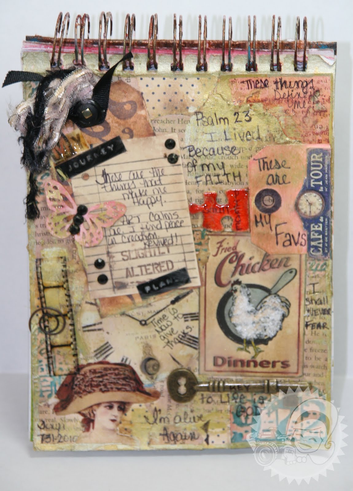
Today, I was inspired to share with you my favorite pages in my art journal. This page was a collage of things that were on my desk. LOTS of scraps, things I fussy cut, and never used.


This is a closer look at the top.  The paper on this page is my favorite Prima paper of all time - Flights of Fancy.  All I had left of it were the tiny scraps, so I decided to use them as my base.


Here is a glimpse at the bottom of the page...


Unintentional at the time, but I decided to write down all the things that I love. Like Fried Chicken, Butterflies, TH Film strip - I hope he never stops making this, Clocks,  Keys, and vintage images. Then as I began doodling I started writing in things that came to mind - like Psalms 23, I shall never fear, I'm alive, and Time is now to give thanks. There are so many textures, colors and elements to this page, I can literally sit and stare at it for hours.

This is a much simpler layout but just loved the theme.  "You & Me" was inspired by the Daisy rhyme "He Loves Me - He Loves Me Not".


I used the stem of the daisy as a time line - and the broken petals represent the loves me loves me not game that young girls often play when they grab a daisy.  Daisies are one of my all time favorite flowers.  I just love them, they always looks so fresh. 

Keep sharing your art journal pages, I love seeing the creative play.

Thanks for stopping in today,

Tonya Gibbs
Read More »
I love seeing things you create using my tutorials or project shares. Please use the following handles/tags in social media to insure that I get to see your creations:

INSTAGRAM: #FollowingTonyaGibbs    |   TWITTER:  @gibbst    #FollowingTonyaGibbs   |      FACEBOOK:Tag  Tonya Gibbs   #FollowingTonyaGibbs

I Design for:

    http://www.yvonneblair.com

Guest Artist: Click icon to see post!

http://www.teresacollinsdesignteam.blogspot.com/2013/10/family-stories-layout-and-video-by.html#comment-form   http://canvascorp.com/2013/03/21/easter-treat-baskets/


Past Teams

http://www.die-namites.com/     marion