Follow Me...

       
Thanks for stopping by! Don't forget to subscribe!

Friday, June 29, 2012

April Journal - Marion Smith's Digital Downloads

0

I finally found the time to finish working on my April Journal for Marion's Monthly challenge.  I used her April Digi Downloads that can be found at http://www.apieceofcraft.com.


I decided to Coptic stitch the journal and I love how primiative it made this book look.  I used some of Marion's vintage trinkets on the cover and distressed them with patina rub-n-buff  and Picket Fence Distress Ink  to pop a little color on the cover.   The Tim Holtz word plate says "Live in the Moment" which is perfect for a monthly journal.

It is so awesome to look back at each month and see all of the things that have gone on in my life.

here is a video page by page walk through of the journal:


Thanks for stopping in today,

Tonya Gibbs
http://www.psychomoms.com
Read More »

Friday, June 22, 2012

Fairy Belle - Meet Emily

0
Last week I shared with you my journal entries using my Sister In Law's maternity pictures. Well, Ms. Emily was due on July 11 and she decided on June 15 that she wanted to meet us all. 

Today - I am going to introduce you to the newest member of the Gibbs Clan -  Ms. Emily Jean Cunningham she arrived very healthy at 5lbs and 6oz and 17.5 inches long.  Our little Princess needed a layout fitting of royalty and Prima's Fairy Belle seemed to do the trick.


I took 2 sheets of the Fairy Belle 12x12 Paper -  Le Toulle is the top paper, and La Spa is the back paper.  Now this gets a bit tricky --on the La Spa paper I fussy cut around the top portion of the fairy at the top and used her as a pop out.   On the Le Toulle paper I cut out the center section, and used it as a frame over the La Spa.  Then added some dimensional tape between the two layers. Here are some close up pictures of those sections for a better idea.


Then I took the 6x6 paper and cut the fairies and flowers from it to use as layers around the photos.  I added a few of the Eline daisies from Prima and Pearl Centers. I used a Martha Stewart Punch with some Scrap Prima paper to make the daisy leaves for a little more layer.  Then sprinkled a little fairy dust with my Starlight - Clear Glitter Pin over all the stars and on the Eline flowers.  I know the sparkles don't show well in the photos but the layout has a subtle glimmer sprinkled here and there.

This is a Top view so you can see the dimensions. 


Thanks for stopping in today,

Tonya Gibbs

Resources:
  • Prima:
    • 12x12 Fairy Belle:  Le Toulle and La Spa
    • 6x6 Fairy Belle Paper:  Firefly, Dream, Summer Dream
    • Eline Small Daisies
    • Flat back Pearls
    • Scraps from the Annalee Paper Collection for the leaves.
  • Martha Stewart Crafts
    • Trio Butterfly Punch - used scraps from Fairy Belle paper.
    • Branch Punch - scraps from Annalee Prima Paper Collection
  •  Gelly Roll
    • Black Pen (outlined punched butterflies)
    • Starlight Pen (glitter accents on flowers and printed stars)
  • Lace
  • House of 3  - Digibrush  Precious Moments - Gratitude Brush Set

Read More »

Thursday, June 21, 2012

Reinking - Ranger Distress Pads

0
I have had a few people ask me in the past how to re-ink a stamp pad.  We all know that if you add too much you get a soupy mess.  If you don't add enough -  well - you know!

While I can't speak for all stamp pads (since it is specific to manufactorer standards), I can speak for the Ranger Distress Pads. 

I recently took a class with Tim Holtz and he gave a demonstration on the mystery of how much ink to use and technique for refilling your Distress Inks.

First it is important to understand the ink pads themselves. Dye based ink pads are made of felt that is compressed and then laminated with a fabric topper. The fabric keeps the felt together. The felt helps to "suspend" ink.  Think of a sponge you fill it with water and it appears dry until you press it and the water bubbles to the top.   This is exactly how the ink pads work. The ink is suspended in the pad until the stamp presses it and the ink floats to the top and is applied to the surface of your stamp.  With that said -  the Ink will not absorb into the pad without the pad being pressed.

Here are the simple steps:
Verify that you are using the correct ink for the right pad (you laugh that I say this, but my walnut ink lid was on my tea die pad and let's just say I now have 2 walnut pads).


Second the Ranger Reinker bottles are designed SO THAT THE DROPPER holds the perfect amount of ink needed to reink 1 pad.   Fill the dropper with ink and apply all over the top of the pad as demonstrated below...


Next -   Use an old gift card/credit card and scrape the ink into the pad.  You need to apply pressure, and move down the pad, then across the pad until all the ink is absorbed.  This may take a few minutes and seem hopeless at first! 


This is what your pad will look like when all the ink is absorbed.  Notice there are a few drops of ink around the lid? 


Simply wipe around the perimeter of the pad with a baby wipe or moist paper towel. Return the lid to the top.   Your ink pad is now re-inked.  Tim suggests heavy used pads be re-inked every six months to a year. 


One other helpful hint:

There is a myth that ink pads should be stored face down, so that the ink flows to the top of the pad rather than the bottom.  Since we learned at the beginning of this blog that the ink is suspended inside the pad - we know this myth to be false.  You may store your inks in any direction you like for the type of storage system you have.

Thanks for stopping in today - hope this helps!


Read More »

Friday, June 15, 2012

New Arrival - Smash Entry

0
My Sister in Law is expecting her 3rd child, and Aunt Tonya is so excited.  Babies just have a way of making me all gooshie inside.  Ms. Emily will be niece number 8 for me.  I always joke around and say that I'm a grandmother "In Training".  My goal is to be  "Everything" to all of them.  I want them to beg to come see me.  You just can't spoil them too much.

I noticed a trend that is different from when I was having babies 16 years ago, and that is Pregnancy photos.  When I was pregnant with my kids - I never thought to do these photos, and I wish I had.  Kelly's friend Liberty Nobles photographed her pregnancy photos, and I wanted to make a simple little *Smash Spread.   I recently made Kelly a mini album to store these pictures using Prima's new Sunkiss line.  So I had all these scraps that needed to be used.


Except the flowers - everything on this page was a scrap.  The Rub On, on the left page was a scrap from Daisy Dee and has been in my stash for YEARS!  I took the scraps of the Sunkiss paper and pieced them together to create a lovely background.  Then the tiny little scraps I punched a bunch of butterflies to scatter all over the top of the page.   The New Arrival is an old title transparency that I've had for YEARS from Heidi Swapp. The flowers are Prima's small Eline flowers again - they have been around for a couple of years - and I added buttons in the centers of them.  I used an MFT die to cut small doilies from scrap white paper. Then I cut the doilies in half to border the pictures.  Emily is the new baby's name, and I used an old set of chipboard letters.


On this page, I kept with the same theme, but I used some scraps of lace for the picture border on here. 


I just love how these two pages turned out.  I really loved working with the Prima Sunkiss line, and the fact that they took these pictures in a field of yellow flowers - made it perfect.

Do you *Smash?  I find it rewarding to use my scraps and left over embellishments in my *Smash journals.  It feels so good to being able to purge so much at one time.

Thanks for stopping in today,

Tonya Gibbs
Read More »

Thursday, June 14, 2012

Father's Day Wallet

0
I was out blog hopping yesterday and Heidi Swap had the cutest project on her home page.  She made a cute little Father's Day wallet.  I decided that this wallet would be perfect to include in another mini album, in a pocket on a scrapbook page, or as a gift card holder for my husband.

So here is my version:
I wanted mine to have a "grunge & mixed media" tone so I settled on kraft card stock for my base.  I painted some of the panels with red paint and patina Rub & Buff for some. I pulled out distress stains, distress inks, and archival inks and went to town.  For texture & patterns,   I used the "Ultimate Grunge" Stampendous stamp set from Tim Holtz.  The cool thing is you are only limited by your imagination. I decided I needed a little more pop, so I added black magic paint (metallic black) from Folk Art to packing bubble wrap and used that as a stamp. I sprinkled a few tiny quotes and elements as embellishments, and sewed buttons to flaps for a closure.


This view shows the flap opened - I used my Dymo Press Label maker to type this quote "A Dad Puts Pictures Where His Money Used to Be."


On this view you can see how the wallet starts to open  - I used my Pink Paislee Daily Junque stamps to create a small pocket.   The photo is my Daughter, Brittany, in her High School play - The Little Mermaid.


In this view, you can see that I added pictures of my husband with each of our children.  I tried to include memorable pictures from this past year throughout the wallet.


I even included a picture of our dog, Angel who has been in the family for 12 years.   This view is the wallet completely opened.  It is  fun to see the changes in our children in just a few months time.  I placed Tim Holtz Tissue on all of the creases on the inside (make sure you glue under the tissue tape so it stays down), and then stitched over the top of that with my sewing machine.


This is a view of the back of the wallet. 


So how do you make it?
I have a video that explains everything...


Thanks for stopping in today,
Read More »

Friday, June 8, 2012

Overcoming A Creative Rut

0
I've been in a scrappy rut lately. Seems like everything is starting to look the same.  So I decided to create a self challenge to snap me out of it. 

My Mission - Use supplies that are new, use something old, try new techniques, and Don't CLUTTER IT UP!  That last one was a real challenge cause I like LOTS of stuff!  I want to play with a product that I've never used. The Prima Resist pieces, and Prima Canvas Tape were my new products. I've used the resist pieces before in other layouts - but I've never colored them. I also pulled out my Timmy Distress Markers, and decided to use them (they are like new - rarely use them).
I made this layout with photos of my two lovely nieces Averie and Addie.  (You will see lots of posts with the pics from this photo shoot.)


I outlined the resist pieces with the Timmy Distress Markers then used Glimmer Mists instead of water to activate the ink. I just love how these two products work together.


I love all the textures, and colors in this layout. The two small photos compliment the layout well, and become larger with the layered embellishments. The Hymnal that was used was titled Good Morning, and talks about giving thanks to God for a beautiful morning.


Here is a start to finish video of me making the layout


I believe this layout will be treasured as one of my favorites.

Do you ever get in a creative rut? How do you kick start your brain into thinking differently?

Thanks for stopping in today,

Tonya Gibbs
http://www.psychomoms.com

Resources:

  • Prima: Printery Canvas Resists, Flowers - Vivian Eliza, Cotton Tape (I made this into a tags), Paper - Fairy Flora Collection "Sunny Day", Brick Stencil
  • Tattered Angels:  Glimmer Mist - Wheatfields, Pink Taffy, Honey Dew Melon.
  • Ranger Ink: Distress Refill - Peacock Feathers, Walnut Distress Stain, Distress Markers - Worn Lipstick, Brushed Corduroy, Peeled Paint.
  • Gesso
  • Lace Remnant
  • Hymnal Page
  • Eyelets
  • Ashlynn Vines
Read More »

Thursday, June 7, 2012

Mixed Media Layout - Start to Finish

0
I've been in a bit of a scrappy rut lately and wanted to try some different things to see if I could stimulate a little creativity.   As Pablo Picasso once said "Inspiration exists, but it has to find you working."

I pulled out some supplies that have just been sitting for a while; such as, some of my Glimmer Mists, Stamps, Stencils,and Goosbumps from Tsukineko. I even reached down deep in the hoard vault and pulled out my Strawberry Kiss - Raspberry Lemonade paper from Prima. I was inspired when I bought them, but haven't used them since. I set out to make a canvas, but decided on a layout instead.

This is my Niece Addie - running towards me during a photoshoot at Easter Time.

From Flamingo Scraps: Prima: Green Lace, Floral Stencil, Valentine Vine, Stamps: Hexagon, Build A Baubble, & Script, Paper: Script, Packageing, Strawberry Kisses - Raspberry Lemondae, Printery - Chipboard (Bird & Bird Cage), Wooden Ticket - Happy, Flowers; Tattered Angeles Glimmer Mist: Jack Frost (blue), Wheat Fields (brown), Perfect Peach, Sweet Clover (green), Cosmos (Pink); Ranger: Distress Stains - Tea Dye, and Walnut Stain. Rock Candy Distress Stickles; Other: Gesso; Tsukineko - Goosebumps; Hymnal Page: Jesus Loves the Little Children, Chipboard Letters Pink, 2012 - Party Confetti, Burlap


I ripped a page from a hymnal to use on the layout and was pleasantly surprised to read "Jesus Loves the Little Children" was the song. Devine intervention? Maybe, but regardless - I feel it was a sign that God was speaking to me.

Here is a closer look at the embellishments:

I have prepared a Step by Step video of the process for making this layout:


Thanks for stopping in today,


Read More »

Friday, June 1, 2012

Art Journal Share

0
The Artsy Addicts Facebook page has been filled with mixed media and art journal projects for the past few weeks. I just love seeing the things that are being created.

Art journals are nice because they provide you with a creative outlet with no agenda. It is a place to play with techniques or mediums.  No rhyme, reason, or objective - JUST CREATIVE PLAY. It is nice  to  have a space to sit and play.

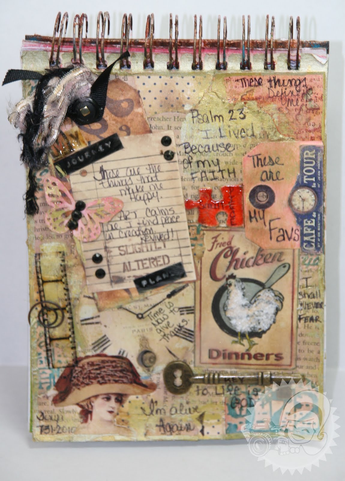
Today, I was inspired to share with you my favorite pages in my art journal. This page was a collage of things that were on my desk. LOTS of scraps, things I fussy cut, and never used.


This is a closer look at the top.  The paper on this page is my favorite Prima paper of all time - Flights of Fancy.  All I had left of it were the tiny scraps, so I decided to use them as my base.


Here is a glimpse at the bottom of the page...


Unintentional at the time, but I decided to write down all the things that I love. Like Fried Chicken, Butterflies, TH Film strip - I hope he never stops making this, Clocks,  Keys, and vintage images. Then as I began doodling I started writing in things that came to mind - like Psalms 23, I shall never fear, I'm alive, and Time is now to give thanks. There are so many textures, colors and elements to this page, I can literally sit and stare at it for hours.

This is a much simpler layout but just loved the theme.  "You & Me" was inspired by the Daisy rhyme "He Loves Me - He Loves Me Not".


I used the stem of the daisy as a time line - and the broken petals represent the loves me loves me not game that young girls often play when they grab a daisy.  Daisies are one of my all time favorite flowers.  I just love them, they always looks so fresh. 

Keep sharing your art journal pages, I love seeing the creative play.

Thanks for stopping in today,

Tonya Gibbs
Read More »

Thursday, May 31, 2012

Micro Mini - Take Note

0
It's the Little Things from Fancy Pants Designs is the star of this ATC sized Micro Mini/Journal. I just love this paper and it was destined to be a mini album from the second I purchased it.

From Flamingo Scraps: Fancy Pants Designs - It's the Little Things Paper Collection, Webster's Pages - Lime Bloomers, Lace, Prima flower, Prima Leaves. Other: Echo Park - Take Note Quotes


This little cutie would be perfect for cell phone images or quotes. Just love it.

Here is a short video that flips through the mini page by page.


Thanks for stopping in today,
Read More »

Friday, May 25, 2012

Father's Day Frame

0
Father's Day is right around the corner, and today I wanted to share with you a little altered frame I did for my husband for Father's Day. 


I used Garett Smith's Digi pages that are available at http://www.marionsmithdesigns.com to cover a 4x6 wooden frame from the dollar bin. I love the rich tans and masculine motifs in this paper line, so I fussy cut a few of the designs out to use as embellishment on the frame.  The back side of the frame is stained so it has a nice clean look in the back.

In the next few days I want to get a picture of my daughter, son and husband so I can replace the photo before Father's Day.

Have you started working on Father's Day gifts?  If so then be sure to share your projects on the Artsy Addicts facebook page. Don't forget to tag me in the comments. I would love to see them.

Thanks for stopping in today,

Tonya Gibbs


Read More »

Monday, May 21, 2012

Mini Prim Rose Journal

0
A few days ago I shared with you the Primrose Mini Album that I created using Marion's digi downloads.  I loved this mini so much that I decided to make one in ATC size and keep it next to my computer as a quote book.


On the cover I used ATC sized sticky backed canvas and painted it with Santa Baby and Creme de Chocolate Glimmer Mist.  I used Marion's Vintage Trinkets for decorations and one of the new Tim Holtz phrase plates.

REDUCING YOUR IMAGES
To print the image in ATC size - in the Printer Dialog box change the Page Sizing to: Multiple pages and Pages per sheet to 1x2. Make sure the orientation is also set to Portrait. This will reduce the size of the images to half the size and give you the ATC size.


Make sure you do this with all of your add-ons, covers, and embellishments in order for them to print to scale.

Here are the two box side by side to show the difference in sizes. 


I think I want to make one of these each time I do a monthly journal. Then at the end of the year, I can share them with my scrappy friends for Christmas presents.
Read More »

Friday, May 18, 2012

Primrose Mini Album

0
This week I decided to play around with the latest digi journal from Marion Smith Designs.  This little Prim Rose Journal is so cute it measures 4x6 completed.  I combined this Journal with the Journey kit to create my extra signature pages.  The two kits work so well together.

I printed my covers on grunge paper and they have a really nice suede feel to them.  They were mounted onto black chipboard for additional stability.  Then I decorated the cover with a Tim Holtz key hole, and one of Marion's Vintage trinkets.


Here is a step by step video of the completed book.


Thanks for stopping in today,

Tonya Gibbs
http://www.psychomoms.com

REFERENCES:
Read More »

Tuesday, May 15, 2012

Sunday Picnic Card

0
Oh I'm sooo in love with the new Webster's Pages collections Sunday Picnic and Perfect Motifs.  The papers feel like linen and the soft muted colors are fun and playful. I love the balloons, kites, and summer bright flowers. 

I am totally on a card making kick right now and decided to use the Rainbow Sky page from the Sunday picnic as my background for the card. 

Webster's Pages: Sunday Picnic, Perfect Motifs, Ranger: Glossy Accents, Laces, Prima: Eline - Daisies and Hydrangeas Copic Sketch Markers: 0, E00, E11, E25, E31, E35, E37, E47, E50, R02, BV0000, BV00, BV02, BV04, C1, C5, C9, The Greeting Farm: Ms Anya Dressy Stamp, Studio G: "Just For You" Stamp, Webster's Pages online: Digi stamps: Lady & Gents Brushes and Journal Cards.


The girl is a Copic colored Greeting Farm stamp from Ms. Anna Dressy. I decided to frame her with one of the digi brushes from Webster's pages. The balloons are at various heights with pop dots to give them depth, a touch of glossy accents were added to them to give them shine.  I cut the bicycle, balloons and "play" from the motifs stack, added a few Prima flowers and rhinestone centers, then trimmed out the base with some lace from Flamingo.
Thanks for stopping in Today.
Read More »

Friday, May 11, 2012

Mother's Day Card

0
For this card,  I used the Pink Paislee Sweetness & Parisian Anthology Lines. Both were pieces of scraps, which I love to use on cards. The background paper is the "Love Notes" paper from the Sweetness Collection, I cut the envelope from Parisian Anthology scraps, and the corrugated chipboard accents (Heart, flags, and butterfly) are Parisian Anthology as well.

I spread some Texture Crackle Paste from DecoArt over the background layers to bring forward "love notes" layer. After the crackle paste dried, I covered the entire card backing with Picket Fence Stain from Tim Holtz. This really softened up the bright colors of the paper, and gave me a chance to bring elements into the forground.


I wanted my card to open differently. I've been working on invitations for my daughter's graduation, and I noticed a card backing called a "Z- FOLD” they basically fold in the Z fashion and then either display flat or in the z shape. Well I decided to modify this a bit using a square card. This way my Mom can display the card on her dresser open so that the front of the card and the sentiment are both displayed at the same time.


Here is a view of the card opened as you can see here the inside displays with the outside of the card. Love this effect!


Watch a step by step video of me putting this card together... Thanks for stopping in today, and Happy Mother's Day to all!
Read More »

Friday, May 4, 2012

My Baby is Graduating

0
Warning - this post may cause tears. Grab tissues before reading further...
This month has been super emotional for me. Brittany my oldest is graduating from high school on June 1, and there are so many emotions running around inside me. I am so happy with the woman that she has become. She has been taught everything she needs to know to soar, but sad that she will stretch those wings and leave the nest.

Last week I took her Cap & Gown pictures and I believe that was when it hit me. She's growing up she will soon embark on a new beginning. I know she will be around, but she takes that step into adulthood and a step closer to her independence. She's super talented, smart, fun, and dependable so I know the world will embrace her.

Through all of these emotions, I started thinking about creating a layout for the "posed" photos that are often not so fun to play with. I didn't want to use the typical "graduation" theme paper, so I settled on Prima's Printery Collection. It has a lot of elements that you will find in your daily high school life: clocks, keys, script/text, and words like "memories". The neutral colors lend themselves to any direction or theme.

To spruce up the background, I decided to use some stencils and texture paste, I used the brick stencil in the left corner, and a number stencil in the upper right and bottom left, and a Prima Rose stencil to frame the center of the layout. Then I spritzed the layout with Jack Frost Glimmer Mist to add the blue to compliment her cap and gown.

The bridge is symbolic of her cross over into another phase of her life. I found a dictionary page with the word "jazz" and used the Printery chipboard pieces for Song and Chorus - since those words seem to define her high school interests. The clock symbolizes her time of passage. The 2012 is a piece of confetti I got from a party store, and it represents her class year. The Prima sprays offer the softness and purity. The Key is to her future, and I hope she has the faith to unlock her dreams. Her photo was framed in this beautiful ornate frame from Melissa Frances.


The hidden journaling includes a quote from a Mark Harris song - "Find Your Wings" the quote is....
"I'll have tears as you take off, but I'll cheer as you fly."

Thanks for stoppping in today,
Tonya Gibbs
http://www.psychomoms.com


Sources:
  • Prima: Printery Paper, Valentine Vine White, Printery Masks, Printery Chipboard, Say It In Pearls & Lace boarder, wooden clock, wooden banner, Printery canvas key, Shabby Chic resin piece - bridge.
  • Tattered Angels: Glimmer Mist - Jack Frost
  • My Favorite Things: doily die
  • Melissa Frances: ornate frame
  • Golden: Texture Paste
  • Maya Road: wooden ruler
  • Misc. Lace, script vellum envelope, 2012 confetti, twine, dictionary page.
Read More »

Wednesday, May 2, 2012

12 years ago...

0
Twelve years ago we were scrapbooking with stickers, using dictionary definitions on EVERYTHING, most layouts were "blocked", No one had ever heard of layering, flowers, or even Prima! GASP! How on Earth did we survive? 

My daughter graduates this month from high school, and I've been walking down memory lane, and thought I would take you guys on the journey with me this week.

This is a layout I did of my daughter with her kindergarten graduation photos. Her Kindergarten teacher was the BEST - Mrs. Murphy, and her favorite quote was from "All I Need to Know I Learned in Kindergarten" by Robert Fulghum. 

It is so much fun to look back at the older layouts. Actually sometimes I find it refreshing when I see how clean they were.  It was a simpler time for scrapbooking. 


The 3D styled elements on this page were printed on the DaisyD stickers. The wire and "ABC" on the left of the title - printed. The buttons on the photo frame - printed. When I tell you this layout was flat - it is FLAT!  The most advanced element for the time on this page were the snaps on the definition page. I didn't know it then, but this page was actually hybrid.  The title, teacher's name, and definition were all printed on my computer. The Jolee's stickers were all the rage and the trendy thing to add to every layout.

This week I created this layout of my daugther in her senior cap & gown photos. And let me tell you some tears were shed over this one. 


From Flamingo Scraps: Prima: Printery paper, Valentine Vine - White, Printery Chipboard, Printery Canvas Resists, Resin - bridge, Wooden Clock, Wooden Banner, Say It in Lace & Pearls Boarder; Maya Road: Wooden Ruler, Melissa Frances Resin Frame; Crocheted Lace, Eyelet Lace, Tattered Angeles - Glimmer Mist - Jack Frost.  Other: Twine, Doily Dies from MFT, Golden Texture Paste.

It was fun to compare the two layouts side by side and see how much my style had changed.  I still prefer 1 photo to a layout, however, notice how this layout has more texture, and dimension.  Gone are the days of the DaisyD stickers, and yes, Prima is front and center of the current "Must Haves" list.  

I heard someone say the other day that they wanted to redo some of their older layouts.  I say "no way". When a layout is created, it is not just a reflection of the memory that you are sharing, but also of the creator (at the time) and the styles of the day.  You are creating the looks that our children will embrace as "vintage".  Only look back to remember the journey - never to recreate.

 I wonder what names and styles will be around when she graduates from college?

Thanks for joining me today,

Read More »

Thursday, April 26, 2012

Cosmo Mini

0

Recently I purchased some of the Tim Holtz binder rings and thought little minis would be a cute item for me to make for RAKs and gifts. My challenge was to use up things that I've had in my stash for more than 6 months. I accomplished that with the Cosmo Cricket Girl Friday paper collection, Prima packaging, Prima hydrangeas, scrap paper, ribbon remnants, Bloomers, Cardstock, and beads. Nothing in this album except the binding rings was new - NOTHING.

I decided to use Cosmo Cricket's Girl Friday collection because of its bright colors and ledger styled "B sides".

On the cover, I bound the book with cardstock, and used 4x6 panels of the paper collection to decorate. I used Pink Paislee packaging to die cut the book plate, and hand wrote "A Story". Butterflies were punched from scraps and Prima Hydrangea flowers were used with buttons as centers. Webster's Pages Bloomers and eyelet lace soften the spine. I used two mini binder clips from an office supply store, and attached charms and a chain for the perfect closure.

Prima packaging was used to make a double pocket. For extra notes, I ripped some paper from a small notebook, and placed it in the pocket. I included 2 small tags in the upper pocket. On the right the banner at the bottom was printed on the bottom strip of the paper collection. Remember to look for embellishments on this strip that is often tossed.

On this page, the mini page with the tag, is Prima packaging that I sewed together to make a pocket. I love that this paper collection matches the ledger style packaging so well.

Again Prima Packaging was used to create the pocket on this page.

I used a glassine bag as a pocket on this page, and used the strips at the bottom of the paper collection as an embellishment.

On this page I used washi tape on the left page. To mimic the same look on the right I used some of the Pink Paislee Packaging cut in the same style on the right.

I always buy buy buy when the products are new, I'm so excited when I get home. Then I place them in a drawer where they are horded forever. I'm trying really hard to use the items that I have purchased, and it seems that I'm falling in love all over again.

Thanks for stopping in today

Read More »
I love seeing things you create using my tutorials or project shares. Please use the following handles/tags in social media to insure that I get to see your creations:

INSTAGRAM: #FollowingTonyaGibbs    |   TWITTER:  @gibbst    #FollowingTonyaGibbs   |      FACEBOOK:Tag  Tonya Gibbs   #FollowingTonyaGibbs

I Design for:

    http://www.yvonneblair.com

Guest Artist: Click icon to see post!

http://www.teresacollinsdesignteam.blogspot.com/2013/10/family-stories-layout-and-video-by.html#comment-form   http://canvascorp.com/2013/03/21/easter-treat-baskets/


Past Teams

http://www.die-namites.com/     marion