Follow Me...

       
Thanks for stopping by! Don't forget to subscribe!
Showing posts with label Masculine. Show all posts

Tuesday, January 31, 2017

Love Like Crazy Cards

0


Hi crafty friends, I hope you have lots of inspiring ideas after the sneak peeks from Creativation 2017. I know my head is SPINNING AROUND!   Yvonne has released some fancy new word stamps along with a few cute little sketch stamps. Here are a few of my favorites from this release I picked to feature in today's post. I have linked them up for you to purchase from  Impression Obsessions Website,  but I also encourage you to support your local retailers if they carry Yvonne's stamps.


http://www.iostamps.com/1NEW/D17166.html

http://www.iostamps.com/1NEW/E17162.html


http://www.iostamps.com/1NEW/C17153.html


It is sometimes difficult to create masculine cards.  With Valentine's Day around the corner, I thought I would use these stamps to create a few cards that could be used for multiple purposes. Either simple "I love you cards", "Happy Birthday", "Thinking of  You" or you could even add "Happy Father's Day" to the inside of these cards to use all year long. The concept for both cards are the same; however, one card is flat for mailing, and the other is dimensional in case you are sharing face to face. 

 This is the flat design:

Both cards are top folding A2 sized cards.  The background cardstock is measured at:
4.25 in. wide  x  11 in. long (scored at 5.5 in.) 

Then I used a pieces of Canson 140lb white  watercolor paper as my base (Smooth side)
cut to 3.75 in. x 5 in.  (this leaves a 1/4 inch border)
Using watercolor paper insures that it will hold up
to the wet mediums and won't buckle or peel.

For my background I used:
Prima's Finnebar White Crackle Texture Paste
with a Tim Holtz Burlap stencil
allow this to dry

To apply color to my background I used
Lindy's Stamp Gang Starburst Stains:
Tibetan Poppy Teal
Edelweiss Moss Green
Rudolph's Nose Red

 
This is the dimensional card:

Here is a quick video showing the process of how these cards came together:


I love the dragonflies, and now I have lots more to use in different posts, and other mixed media projects.  It is hard to see in the photos, but they are super shiny. While they are primarily the same cards, they do have distinctly different looks.  


Stay tuned in the coming weeks as my fellow Art Girls share more from the Winter 2017 Collection.  You are going to want them all!  Thanks for hanging out with me today.
Read More »

Friday, October 23, 2015

Class of 2015 Mixed Media Layout

1

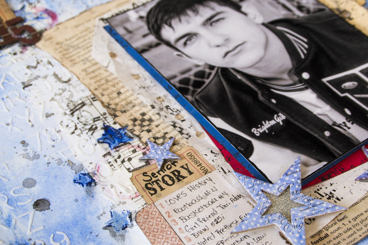
Happy fall everyone! I've been away for a while - have you missed me? This time of year is a MESS in my world. Just busy busy with lots going on in my personal life. Today, with the kids back in a school, and lots of "sports" photos being taken, I thought I would share with you a masculine layout to inspire you to scrap those teen school photos. My Son graduated last year, and the photo taken here, was one we used in his senior announcement.
 
 
I gathered up lots of Faber-Castell Design Memory Craft® to create a colorful background for my black and white photo.   I just love all the texture and grunge. 
 
 
What teen doesn't have music blaring 24/7? So I used Gel Medium to add music tissue paper to the background. The Boysenberry Gelatos® was the perfect blue to add color to my white card stock and represent his school colors of red and blue.   Once it was dry, I applied Whipped Spackle through the School House Stencil from Tim Holtz. This gave me some subtle texture.  For my journal area, I add a list of Brighton's top 10 details from his Senior year.


I also used the Boysenberry Gelatos® and the Tim Holtz Stars Stencil to add a few grungy stars to my background.  I created a wash with the Double Scoops® Red Cherry® and used a bottle to add a few circles in areas around the background.   For more texture, I used my Stamper's Big Brush Pen in Black as a stamping ink with some grungy texture stamps from Tim Holtz.  


I also gathered a few items that I thought would set the tone for a "school" themed layout.  Since my Son is a HUGE lover of all things historical, I figured a page from the Life of Abraham Lincoln would make the perfect photo mat. I also pulled a few mini file folders, notebook paper, grid paper, dictionary paper with the football definition visible to add to my photo mat layers.  If your son is anything like mine, his homework always looked like it had been stuffed in the bottom of a back pack for weeks.  To achieve this look, a crumpled up the papers and used the Nougat Stamper's Big Brush Artist pen to distress the edges.  I also wanted the entire piece to have a messy handwritten look, so I hand wrote my journaling and titles. To finish off the embellishment clusters, I used tickets and charms for my ephemera. Heidi Swapp's chipboard stars added depth, and show he is my "All-Star".  

Here is a quick video showing how I created the layout.  


Thanks for stopping in today,  I hope you have a great weekend.
 
Tonya
 
Supplies:


Read More »

Friday, June 19, 2015

Father's Day Card Tutorial

0

Hi everyone, today is my day over on Limor Webber Designs' DT Inspiration Blog.    I hope you get a chance to stop in and take a look at this deliciously grungy Father's Day Card that I have created using the Limor's Signature products with Lindy's Stamp Gang and IndigoBlu.   


Thanks for stopping in today! 
Tonya 


Read More »

Monday, June 15, 2015

Father's Day Card for Die-namites June Sketch and Dare Challenge

5
Hi everyone,  I had a great time this weekend playing with my little nephew Cooper.  He spent all day Saturday with me, and I shared with him the Gelli Plate. My entire dining room table was covered in gorgeous prints.  I saved back a few of his prints, to create Father's day cards.  Here is little Cooper pulling what he called his favorite print - which he promptly took home to keep. LOL - I love this so much!


I decided to participate in this Month's Sketch & Dare Challenge over on the Die-namite's blog.  Here is the sketch.


http://www.die-namitesblog.com/2015/06/junes-sketchchallenge-and-winner.html
 
 
I used the Leafy Flowers die in my blog post today.

http://www.die-namites.com/Leafy-Flowers_p_104.html

On this print, Cooper used Plaid's Kiwi and English Navy Apple Barrel craft paints with the Crafter's Workshop Gear stencil.  It made a really interesting looking print.  Very Masculine!   So I decided to cut my die from navy blue, and use the same cardstock for my card base.  The card is an A2 top folding card.  


Lately, I've been practicing hand lettering for card sentiments.  So this seemed like a perfect opportunity to doodle the sentiment for the front and inside of the card.


Here is a process video of me creating the card from start to finish.  I think I might give this card to Coop to share with his Dad. 


TO ENTER the Die-Namites June Sketch Challenge please visit the blog post. Don't forget to link up your card before the last day of the month. 
 
Thanks for stopping by today,
 
Tonya
 
 
Supplies:
  • Die-namites Dies Leafy Flowers
  • Navy Blue cardstock
  • Kraft cardstock
  • Ranger Ink - Tim Holtz - Distress Ink - Vintage Photo
  • Ranger Ink - Archival Ink - Coffee
  • Tim Holtz - Idea-ology  Tiny Attacher
  • Gelli Plate
  • Plaid - Apple Barrel Craft Paint - Kiwi
  • Plaid - Apple Barrel Craft Paint - English Navy
  • The Crafter's Workshop  - Mini Gears
  • IndigoBlu - Limor Webber Designs - Rugged Edges Stamps
  • Speed Ball - Brayer
  • Foray - Gelio Gel Ink Pen .7mm
  • Liquitex - Irridescent Bright Gold Ink


Read More »

Saturday, November 29, 2014

Masculine Mixed Media Card - Time to Celebrate

1

OH MY GOODNESS - Why have I waited so long to purchase a Gelli plate?   I'm having so much fun!   I've created dozens of prints over the last few weeks.


I wanted to share an idea of how to use those prints.  If you have followed me for a while, you know that I'm just not much for "journaling".  Don't get me wrong, I have dozens of journals, and I have some that are mixed media, that I've started.  But I like to practice techniques on card stock then create projects with them, instead of hiding them away in a journal.

I created this masculine card to give to my nephew for his birthday.  These Gelli prints are PERFECT for Masculine card backgrounds.  So FUN, vibrant, and the perfect amount of grunge.

Earlier this year, I shared with you a post on how I created these wood veneers from the wood shapes you find in the craft section and stamps in your stash.  This is a perfect way to create custom embellishments with a trendy flare without breaking the wallet.  But I also encourage you to dig through your stash, and see if you can find something that would work.  Perhaps stickers of clocks, puzzle pieces, gears, washers, clocks, wood shapes, or  hexagon shaped die-cuts.


For the inside of my card, I used the Heidi Swapp Coral ink and a Fiskars Hexagon Sentiment Stamp set.  The "Time to Celebrate" perfectly mimicked the cluster of embellishments on the cover.

I have prepared a process video, showing how I put the card together:


I hope you enjoyed my share today,  Don't forget that we have a Ustream, Monday, December 1, 2014  at 8:30 p.m. Est.  We are going to create some fun Christmas cards using Gelli Prints and Die-nmaties Dies.

Thanks for stopping in today,
Tonya

Supplies:

  • Gelli Plate (any size)
  • Paint (colors of your choice)
  • Faber-Castell Design Memory Craft® Whipped Spackle.
  • Fiskars Hexagon Sentiment Stamp
  • Heidi Swapp Coral Ink
  • Heidi Swapp Honeycomb Stencil 6x6
  • Prima Wood Veneer Celebrate Flag
  • Recollections  Wood Veneer Frame
  • Cardstock
  • 7 Gypsies Gears
  • Twine

Read More »

Saturday, July 26, 2014

Masculine Mixed Media Layout

2


Hi everyone today is my day over on the Die-Namite's blog.   I have this awesome mixed media layout that I created with Canvas Corp Brands  & Die-namite Dies.   


There is a process video there showing step by step how this layout was created.
 I hope you have time to stop by and take a look. 

While you are there, there is a contest going on, here are the details. 


One of the most essential aspects of die cutting with Die~Namites Dies is the paper you use. Canvas Corp Brands, which includes Canvas Corp, Tattered Angels and 7Gypsies, has plenty of papers to choose from.


A HUGE THANK YOU to Canvas Corp Brands for their generosity to the Die~Namites Design Team. Our kits consisted of Canvas Corp Printed Cardstock, Tattered Angels Mistable Papers, a bottle of Tattered Angels Glimmer Mist and Glimmer Glaze, along with other goodies.


ONE RANDOMLY CHOSEN winner will receive their very own Canvas Corp Brands Kit along with a $25 Gift Certificate to Die~Namites Dies. Make sure to stop by everyday and leave a comment!


Thanks for stopping in today,

Tonya


I love seeing things you create using my tutorials or project share. Please use the following handles in social media to insure that I get to see your creations:
INSTAGRAM: #FollowingTonyaGibbs | TWITTER: @gibbst #FollowingTonyaGibbs | FACEBOOK: Tag Tonya Gibbs #FollowingTonyaGibbs
Read More »

Sunday, June 29, 2014

Terrific Kid Layout for Faber-Castell Design Memory Craft®

0
Today is my day over on the Faber-Castell Design Memory Craft® blog.   I have created a mixed media layout and a process video with lots of details.  I hope you have time to stop by and get the details.


 Here is the link o the post.  There is a process video there showing step by step how I created this layout.

Thanks for stopping in today.

Tonya 
Read More »

Friday, May 30, 2014

Masculine Layout Tips

0
 
 
Well this is my last post of the month, and I issued everyone a challenge to create masculine  projects. The scrapbooking industry is full of products for feminine designs and it is sometimes a challenge to create for the men in your life. All month Peggy and I have been sharing some great projects over on the Artsy Addicts blog, that I hope have inspired you. Today I thought I would recap some tips on how I set out to create Masculine layouts.


1)  Dig around in your stash for items that have a neutral theme and color.   I like to select colors that are blue, red, neutrals (grey, tan, brown, black, white) and green.  Not that there is any kind of rule to sticking to a color, I just find that these colors help my focus stay masculine.
 
2)  Look for embellishments in your stash that are not gender specific, like the Dictionary Tissue Tape from Tim Holtz, Star Sequins, and chevron designs, notebook paper, cameras, arrows, tickets, labels, wood veneers and tags. Metal accents are awesome for Masculine projects.
 
 
3) Select papers that lean more on the masculine side.  Like the Heidi Swapp No Limits papers - which were actually travel papers, but you can't tell after it was used and the Echo Park Note to Self (which has a lot of things you can fussy cut to add interest to your layout).


 Here is a process video of me making the layout!
 
 
Here is the finished layout. 


My son's girlfriend said to me yesterday "I like that this layout is very masculine, but still has a lot of sparkle!"   Don't be afraid to use sparkle elements or even flowers on a masculine layout - just don't over do it!  
 
 
I hope this post has helped you with ideas on creating masculine projects.
 
Thanks for stopping in today,
 
Tonya Gibbs


Resources: 

Heidi Swapp  - No Limits Paper collection
Heidi Swapp - Confetti Stencil 6x6
7 Gypsies Paddington clear stamp
7 Gypsies - Postale Index Cards7 Gypsies - Naked Index Cards
7 Gypsies - Library Drawer - Tabbed Dividers - Naked Tabs
My Mind's Eye - Everyday Funday kraft - Everyday Fun stamps
My Mind's Eye - Find Your Wings & Fly - Stamps
Tim Holtz - Idea-ology - dictionary tissue tape
Tim Holtz - Idea-ology - Tiny Attacher
Sizzix - Tim Holtz - Alterations Frameworks Border Die Chevron
Studio Calico - Wood Veneer Hearts & Arrows
Studio Calico - Wood Veneer School Days Speech Bubbles
Ranger Ink - Archival Ink Vermillion
Cosmo Cricket - Glitter Adhesive Sheets  Red, Blue, Silver
Fiskars Circle Punch - 1.75 Inches
Marvy Circle Punch - 2 Inches
Washi - Red Chevron
Prima Wood Veneer Camera
Black Sharpie
EK-Success-Notebook-Border-Punch
EK Success Zig Writer
Clear Glitter Nail Polish
Star Sequins
Grid Line Index Cards
Labels
Color Box Pigment Stamp Ink Silver
Color Smart Pigment Stamp Ink White
Hampton Art - 7 Gypsies - Clear Acrylic Stamps - Varsity
Hampton Art Rubber Stamp A Day To Remember Numbers
Echo Park  Note to Self

Read More »

Friday, May 9, 2014

Varsity Layout by Tonya Gibbs - May Challenge

0

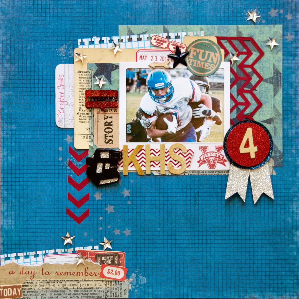
Hi everyone, wow can you believe that school is almost out?  Where did the time go? Seriously It was just fall in my mind.   My son, Brighton, is a Jr. this year and I'm going to spend some time in the next year crying - no seriously - documenting his high school story!   I know it is hard to sometimes create Masculine Layouts so I have a few tips to kick start your creative process.

 
First of all GRUNGE makes masculine layouts come together so easily.  And what better way to get grunge then Mixed Media.  Just like little boys - the messier the better! Texture is my next hint!  I think you can't have too much texture on a boy layout!  


Second - stick to masculine colors.  Like Blues, Greens, black, browns.  Since my son's high school colors are Blue, White & Red, I decided to use them for my focal color pallet.


I typically avoid flower clusters and stick to masculine paper elements.  7Gypsies Vintage Varsity line was perfect for this layout - since it offered so many 'sports' themed elements that could be fussy cut and used for layers. 
 
Here is a process video of me making this layout.


I challenge you to post some masculine projects this month in the AA Facebook page.  From little boys, to grown me, it is a challenge sometimes to work with their photos, but they deserve to be documented too!    With Father's Day in a few short weeks, this will kick start your brain into thinking masculine!  
 
 
Thanks for stopping in today,
 
Tonya Gibbs
 
 
Layout Supplies:  
  • Canvas Corp - White smooth Cardstock
  • 7Gypsies - Vintage Varsity 8x8 pad
  • Stamper's Anonymous & Tim Holtz - The Ultimate Grunge
  • Tattered Angels - Silver Glimmer Mist
  • Faber Castell - Design Memory Craft   PITT Big Brush Artist Pens in the following Colors:
    • Black,
    • White,
    • Cold Grey I 230,
    • Cold Grey IV 233,
    • Phthalo Blue 110,
    • Dark Sepia 175,
    • Deep Scarlet Red 219
  • Faber - Castell Design Memory Craft Gelatos in the following colors:
    • Dark Blue
    • Silver
  • Faber-Castell Design Memory Craft Glaze
  • The Crafter's Workshop 6x6 stencils in the following Patterns:
    • Mini Numbers
    • Mini Well Rounded (this is the grunge stencil)
    • Mini Wonky Circles
  • Liquitex - Full Body Gesso
  • Prima - Distress Tool
  • Pearl Ex -  Interference Red
  • Score Tape
  • Scotch - ATG
  • Scotch - Mounting Foam
  • Idea-ology - Tim Holtz - Grunge Board Numbers
  • Idea-ology - Tim Holtz - Sanding Block
  • Ranger Ink - Dyan Reavely Dylusions Sprays White Linen
  • Cosmo Cricket  - Silver Glitter Adhesive Sheets
  • Studio Calico - Wood Veneer Speech Bubbles
  • Studio Calico - Wood Veneer Abroad Cameras
  • Clear Glitter Nail Polish
  • EK Success - Square Binding Edge Punch
  • EK Success - ZIG Wink of Stella Clear
  • Silhouette Cameo - Primitive  Stars
  • Stars - Rhinestone buttons
  • Index Card
Read More »

Friday, April 25, 2014

Masculine Card using April Challenge by Tonya Gibbs

0


  Today I thought I would share with you a masculine card using the April Sketch Challenge.  By making a few extra adjustments, I was able to convert this feminine sketch into a masculine card. 


For today's card  I used a combo of washi tapes from Teresa Collins Designs Memorabilia and You Are My Happy Collections.   Since my washi tape selection had a horizontal pattern, I decided to change the orientation of the card from the original sketch. TIP:  Rotating a sketch can give the sketch a new look! 


I created clusters that combine the sequins from the Teresa Collins' Family Stories and Memorabilia Collections with the Tiny Stars Wood Veneers from Studio Calico. Substituting the star shapes instead of the heart offered a more "masculine" touch to the card.   The sentiment was a stamp from Fiskars' All Year Cheer Cling Mount Stamps, and Teresa Collins Designs' Memorabilia Enamel Dots in black nicely filled in the negative space under the sentiment.  


Another substitution that offered a more masculine feel was replacing the doily with a few nesting cuts from the Spellbinder's Labels 18 die.  I tried to find a labels die in my stash that best matched the pattern in the washi tape.  In this layer cluster, the background was cut from a scrap piece of 7Gypsies corrugated paper. For the next layer,  I covered a scrap of cardstock with the blue washi tape before die-cutting. All these layers offered a beautiful depth of field for my sentiment. 


I hope I have given you a few ideas of how you can multipurpose sketches to fit your masculine needs. 

I hope you guys have time to participate in the April Sketch Challenge.  There are only a few extra days left. There have been a few submission.  To see them check out the LinkZ app at the bottom of this linked post.  

Thanks for stopping in today, 

Tonya Gibbs
http://www.psychomoms.com 


Read More »

Friday, April 18, 2014

Mixed Media Masculine Card

2
 
I've been sharing a lot of pretty cards lately, and today thought it would be fun to share with you a masculine card.  Lately I've abandoned my art journal for pieces of 4.25 x 5.5 inch sheets of mixed media paper.  I try out new mediums, play with techniques, and then recycle these panels into card backgrounds.  I find that mixed media techniques make masculine cards come together much easier!  And you could always keep the card 1 layer and display your art rather than lots of layers.
 
Here are the steps I took to create the background
 
 
  1. Apply modeling paste to your card with stencil of choice (I used Heidi Swapps Honeycomb)
  2. Use A Faber-Castell Design Memory Craft Pitt Pen to apply color around the image. 
  3. Use your finger to smooth out the ink.
  4. Select a texture Stamp (I used Marion Smith Designs' Texture Stamp)  Apply ink to the stamp with a contrasting PITT Pen 
 
  1. Apply archival ink around the image to give a distressed look. NOTE: you can use distress inks, but if you add water, they will react with that water.  Archival ink is permanent when dry.) 
  2. Spray a wet medium onto a pallet.  I used Lindy's Stamp Gang Moon Shadow Mist in Gossamer Gold  
  3. Stamp a round object into the ink and apply it to your card
  4. You will see a water ring just like it were left from coffee or tea. 
To finish off the background I added pieces of tissue tape with matt medium.   I added the panel to a piece of black cardstock and created this card for my nephew's birthday.


He loves photography, so I took advantage of using up some scraps to create this photo layers.   The Camera and Polaroid Frame were a Spellbinder's Die.  I then added the Tim Holtz Film Strip Ribbon, and Marion Smith's Washi Tape from her Romance Novel Prima line.   Happy Birthday stamp was from Studio G.  My nephew was turning 13 so I added a few school aged elements like notebook paper, music tape, geometrical shapes, tag and paper clip.  
 
Don't forget about the Artsy Addicts Sketch Challenge through out the month.  You can get details here!
 
 
Thanks for stopping in today,
 
Tonya Gibbs
 
 
Read More »

Thursday, March 13, 2014

Boy Birthday Card by Tonya Gibbs

1
Hi everyone, I hope you are having a great week.  My favorite part of Marion's designs are all the little tiny elements that you can fussy cut and cluster together.  Today's project was inspired by the layout I made for yesterday's post.  


I used a  few of the same techniques, but this time, I took elements from Marion's Nirvana collection, and the Texture stamps from Marion's latest release to create the mixed media background boy card. 


Here is how I did the background for this card. 

I started with a piece of cardstock, and spread modeling paste or gesso using your favorite stencil. Allow it to dry completely.

 
Using a Faber-Castell Design Memory Craft Pitt Artist Pen - carefully rub some of the ink onto the stenciled area. Try to avoid direct contact with the cardstock.  Do a small section then go to next step.


Using your finger rub the Pitt Pen Ink to blend, allow some of the ink to spill over the cardstock.


Archival ink was used around the edges to further distress the background.

 
I used a green Pitt Artist Pen directly on my stamps then stamped it onto my background paper.   These pens are temporary blendable ink on a prepped surface as seen on the hexagons.  However, when used on a non-prepped surface they offer a permanent ink solution. 
 
 
Pick a brown watercolor shimmer mist (I used Gossamer Gold by Lindy's Stamp Gang), and spray onto a non-porous surface. I used recycled packaging for my pallet.


 Use a circular item and stamp the bottom into the ink, then apply it to your project. 


The grungy effects give this background and instant masculine feel.   All I have to do now is build out my layers.  In addition to Marion's ephemera, I've also included a chipboard #2, sentiment, twine, and puzzle pieces.
 
 
Thanks for stopping in today,
 
Tonya Gibbs


Read More »
I love seeing things you create using my tutorials or project shares. Please use the following handles/tags in social media to insure that I get to see your creations:

INSTAGRAM: #FollowingTonyaGibbs    |   TWITTER:  @gibbst    #FollowingTonyaGibbs   |      FACEBOOK:Tag  Tonya Gibbs   #FollowingTonyaGibbs

I Design for:

    http://www.yvonneblair.com

Guest Artist: Click icon to see post!

http://www.teresacollinsdesignteam.blogspot.com/2013/10/family-stories-layout-and-video-by.html#comment-form   http://canvascorp.com/2013/03/21/easter-treat-baskets/


Past Teams

http://www.die-namites.com/     marion