Follow Me...

       
Thanks for stopping by! Don't forget to subscribe!
Showing posts with label boy. Show all posts

Thursday, June 26, 2014

Farewell Post for Marion Smith Designs

0
Wow this year has flown by so fast. I've had so much fun working with the products from Marion Smith Designs.  I just love her style. Our team was made up of some the World's most talented in the industry and I feel so honored to call them friends.  They have pushed me to be a better artist, encouraged me, and have always supported me.  Thank you ladies - and I can't wait for our paths to cross again. 

Marion will be announcing her new team in a few weeks, and I don't know if I will be a part of that group.  If not - I wish them the best, but I will continue to support her and her products in future crafty projects. 

For my farewell post I have created a layout of my nephew Cooper and his First Grade Teacher. 


Details about this layout can be found here.   I have also prepared a process video for you too!

I hope you get a chance to stop by and see the details from the post.  Thank you so much for sharing in this creative journey with me.  I look forward to so many more opportunities! 

Thanks for stopping in today,

Tonya Gibbs
http://www.psychomoms.com
Read More »

Friday, May 30, 2014

Masculine Layout Tips

0
 
 
Well this is my last post of the month, and I issued everyone a challenge to create masculine  projects. The scrapbooking industry is full of products for feminine designs and it is sometimes a challenge to create for the men in your life. All month Peggy and I have been sharing some great projects over on the Artsy Addicts blog, that I hope have inspired you. Today I thought I would recap some tips on how I set out to create Masculine layouts.


1)  Dig around in your stash for items that have a neutral theme and color.   I like to select colors that are blue, red, neutrals (grey, tan, brown, black, white) and green.  Not that there is any kind of rule to sticking to a color, I just find that these colors help my focus stay masculine.
 
2)  Look for embellishments in your stash that are not gender specific, like the Dictionary Tissue Tape from Tim Holtz, Star Sequins, and chevron designs, notebook paper, cameras, arrows, tickets, labels, wood veneers and tags. Metal accents are awesome for Masculine projects.
 
 
3) Select papers that lean more on the masculine side.  Like the Heidi Swapp No Limits papers - which were actually travel papers, but you can't tell after it was used and the Echo Park Note to Self (which has a lot of things you can fussy cut to add interest to your layout).


 Here is a process video of me making the layout!
 
 
Here is the finished layout. 


My son's girlfriend said to me yesterday "I like that this layout is very masculine, but still has a lot of sparkle!"   Don't be afraid to use sparkle elements or even flowers on a masculine layout - just don't over do it!  
 
 
I hope this post has helped you with ideas on creating masculine projects.
 
Thanks for stopping in today,
 
Tonya Gibbs


Resources: 

Heidi Swapp  - No Limits Paper collection
Heidi Swapp - Confetti Stencil 6x6
7 Gypsies Paddington clear stamp
7 Gypsies - Postale Index Cards7 Gypsies - Naked Index Cards
7 Gypsies - Library Drawer - Tabbed Dividers - Naked Tabs
My Mind's Eye - Everyday Funday kraft - Everyday Fun stamps
My Mind's Eye - Find Your Wings & Fly - Stamps
Tim Holtz - Idea-ology - dictionary tissue tape
Tim Holtz - Idea-ology - Tiny Attacher
Sizzix - Tim Holtz - Alterations Frameworks Border Die Chevron
Studio Calico - Wood Veneer Hearts & Arrows
Studio Calico - Wood Veneer School Days Speech Bubbles
Ranger Ink - Archival Ink Vermillion
Cosmo Cricket - Glitter Adhesive Sheets  Red, Blue, Silver
Fiskars Circle Punch - 1.75 Inches
Marvy Circle Punch - 2 Inches
Washi - Red Chevron
Prima Wood Veneer Camera
Black Sharpie
EK-Success-Notebook-Border-Punch
EK Success Zig Writer
Clear Glitter Nail Polish
Star Sequins
Grid Line Index Cards
Labels
Color Box Pigment Stamp Ink Silver
Color Smart Pigment Stamp Ink White
Hampton Art - 7 Gypsies - Clear Acrylic Stamps - Varsity
Hampton Art Rubber Stamp A Day To Remember Numbers
Echo Park  Note to Self

Read More »

Friday, May 9, 2014

Varsity Layout by Tonya Gibbs - May Challenge

0

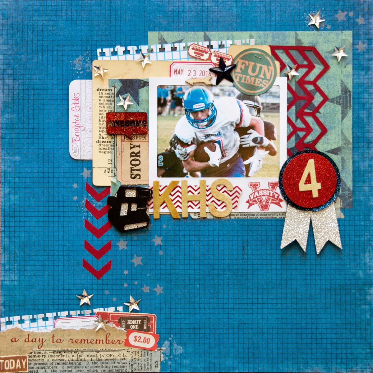
Hi everyone, wow can you believe that school is almost out?  Where did the time go? Seriously It was just fall in my mind.   My son, Brighton, is a Jr. this year and I'm going to spend some time in the next year crying - no seriously - documenting his high school story!   I know it is hard to sometimes create Masculine Layouts so I have a few tips to kick start your creative process.

 
First of all GRUNGE makes masculine layouts come together so easily.  And what better way to get grunge then Mixed Media.  Just like little boys - the messier the better! Texture is my next hint!  I think you can't have too much texture on a boy layout!  


Second - stick to masculine colors.  Like Blues, Greens, black, browns.  Since my son's high school colors are Blue, White & Red, I decided to use them for my focal color pallet.


I typically avoid flower clusters and stick to masculine paper elements.  7Gypsies Vintage Varsity line was perfect for this layout - since it offered so many 'sports' themed elements that could be fussy cut and used for layers. 
 
Here is a process video of me making this layout.


I challenge you to post some masculine projects this month in the AA Facebook page.  From little boys, to grown me, it is a challenge sometimes to work with their photos, but they deserve to be documented too!    With Father's Day in a few short weeks, this will kick start your brain into thinking masculine!  
 
 
Thanks for stopping in today,
 
Tonya Gibbs
 
 
Layout Supplies:  
  • Canvas Corp - White smooth Cardstock
  • 7Gypsies - Vintage Varsity 8x8 pad
  • Stamper's Anonymous & Tim Holtz - The Ultimate Grunge
  • Tattered Angels - Silver Glimmer Mist
  • Faber Castell - Design Memory Craft   PITT Big Brush Artist Pens in the following Colors:
    • Black,
    • White,
    • Cold Grey I 230,
    • Cold Grey IV 233,
    • Phthalo Blue 110,
    • Dark Sepia 175,
    • Deep Scarlet Red 219
  • Faber - Castell Design Memory Craft Gelatos in the following colors:
    • Dark Blue
    • Silver
  • Faber-Castell Design Memory Craft Glaze
  • The Crafter's Workshop 6x6 stencils in the following Patterns:
    • Mini Numbers
    • Mini Well Rounded (this is the grunge stencil)
    • Mini Wonky Circles
  • Liquitex - Full Body Gesso
  • Prima - Distress Tool
  • Pearl Ex -  Interference Red
  • Score Tape
  • Scotch - ATG
  • Scotch - Mounting Foam
  • Idea-ology - Tim Holtz - Grunge Board Numbers
  • Idea-ology - Tim Holtz - Sanding Block
  • Ranger Ink - Dyan Reavely Dylusions Sprays White Linen
  • Cosmo Cricket  - Silver Glitter Adhesive Sheets
  • Studio Calico - Wood Veneer Speech Bubbles
  • Studio Calico - Wood Veneer Abroad Cameras
  • Clear Glitter Nail Polish
  • EK Success - Square Binding Edge Punch
  • EK Success - ZIG Wink of Stella Clear
  • Silhouette Cameo - Primitive  Stars
  • Stars - Rhinestone buttons
  • Index Card
Read More »

Friday, April 18, 2014

Mixed Media Masculine Card

2
 
I've been sharing a lot of pretty cards lately, and today thought it would be fun to share with you a masculine card.  Lately I've abandoned my art journal for pieces of 4.25 x 5.5 inch sheets of mixed media paper.  I try out new mediums, play with techniques, and then recycle these panels into card backgrounds.  I find that mixed media techniques make masculine cards come together much easier!  And you could always keep the card 1 layer and display your art rather than lots of layers.
 
Here are the steps I took to create the background
 
 
  1. Apply modeling paste to your card with stencil of choice (I used Heidi Swapps Honeycomb)
  2. Use A Faber-Castell Design Memory Craft Pitt Pen to apply color around the image. 
  3. Use your finger to smooth out the ink.
  4. Select a texture Stamp (I used Marion Smith Designs' Texture Stamp)  Apply ink to the stamp with a contrasting PITT Pen 
 
  1. Apply archival ink around the image to give a distressed look. NOTE: you can use distress inks, but if you add water, they will react with that water.  Archival ink is permanent when dry.) 
  2. Spray a wet medium onto a pallet.  I used Lindy's Stamp Gang Moon Shadow Mist in Gossamer Gold  
  3. Stamp a round object into the ink and apply it to your card
  4. You will see a water ring just like it were left from coffee or tea. 
To finish off the background I added pieces of tissue tape with matt medium.   I added the panel to a piece of black cardstock and created this card for my nephew's birthday.


He loves photography, so I took advantage of using up some scraps to create this photo layers.   The Camera and Polaroid Frame were a Spellbinder's Die.  I then added the Tim Holtz Film Strip Ribbon, and Marion Smith's Washi Tape from her Romance Novel Prima line.   Happy Birthday stamp was from Studio G.  My nephew was turning 13 so I added a few school aged elements like notebook paper, music tape, geometrical shapes, tag and paper clip.  
 
Don't forget about the Artsy Addicts Sketch Challenge through out the month.  You can get details here!
 
 
Thanks for stopping in today,
 
Tonya Gibbs
 
 
Read More »

Thursday, March 13, 2014

Boy Birthday Card by Tonya Gibbs

1
Hi everyone, I hope you are having a great week.  My favorite part of Marion's designs are all the little tiny elements that you can fussy cut and cluster together.  Today's project was inspired by the layout I made for yesterday's post.  


I used a  few of the same techniques, but this time, I took elements from Marion's Nirvana collection, and the Texture stamps from Marion's latest release to create the mixed media background boy card. 


Here is how I did the background for this card. 

I started with a piece of cardstock, and spread modeling paste or gesso using your favorite stencil. Allow it to dry completely.

 
Using a Faber-Castell Design Memory Craft Pitt Artist Pen - carefully rub some of the ink onto the stenciled area. Try to avoid direct contact with the cardstock.  Do a small section then go to next step.


Using your finger rub the Pitt Pen Ink to blend, allow some of the ink to spill over the cardstock.


Archival ink was used around the edges to further distress the background.

 
I used a green Pitt Artist Pen directly on my stamps then stamped it onto my background paper.   These pens are temporary blendable ink on a prepped surface as seen on the hexagons.  However, when used on a non-prepped surface they offer a permanent ink solution. 
 
 
Pick a brown watercolor shimmer mist (I used Gossamer Gold by Lindy's Stamp Gang), and spray onto a non-porous surface. I used recycled packaging for my pallet.


 Use a circular item and stamp the bottom into the ink, then apply it to your project. 


The grungy effects give this background and instant masculine feel.   All I have to do now is build out my layers.  In addition to Marion's ephemera, I've also included a chipboard #2, sentiment, twine, and puzzle pieces.
 
 
Thanks for stopping in today,
 
Tonya Gibbs


Read More »

Wednesday, March 12, 2014

Rainy Days of Summer by Tonya Gibbs

2
Hey everyone, I bet some of you are ready for a little sunshine.  I know I am!   I was thumbing through some old Facebook photos and ran across this photo of my nephew Cooper when he was about 3 years old.  My sister-in law had taken them to the park to play in the rain, and captured the perfect photo collection!  So fun.  I wanted my layout to mimic the fun times shared during this photo shoot.  


Marion's Never Grow Up Collection is perfect for this Rainy Days of Summer layout! It is full of playful images and vibrant colors.  I love that this collection can be masculine and feminine.   Here is a sample of the products that I used from Marion's lines.


I used my Faber-Castell Design Memory Craft Pitt Artist Pens on the texture stamps from Marion's winter release,  to add depth and texture to the plain cardstock.   Pitt pens are made with India ink and have a slow dry time on a prepped surface allowing for blending. However, on a non-prep surface they make an awesome permanent ink solution!  


I added splashes of aqua watercolor paint to mimic that rainy day, and ground my photo to the layout.  Lots of yummy ephemera were cut from the collection to give the layout that "all boy" feel.   The journaling spot was a scrap from Marion's Digi line!  Here is a glimpse at the final layout!
 
 
I just love how playful this layout is.  These colors remind me of how vibrant it is in the summer just  after a rain shower. 
 
Thanks for stopping in today,
 
Tonya Gibbs


Read More »

Friday, October 11, 2013

Football Layout by Tonya Gibbs

0
From the first of August until sometime mid December my feet are planted in the grass of one football field after antoher 3 - 4 times a week.  I walk the field taking photos of children between the ages of 6 - 18, and I LOVE IT! This year my Nephew, Cooper, played his first down of tackle football the age of six, and you bet, Aunt Tonya was right there walking the field. 

Photos of my Nephew, Cooper, during his first football game.  Photos by Tonya A. Gibbs.

Today,  I want to give you five prompts for creating a layout. Hopefully these prompts will give you a place to start next time Mojo goes on vacation.  For today's layout, I'm going to use the photos from the above mentioned photo shoot.

Prompt 1 - Select papers that do not fit the theme or color pallet of your photos. 

My photos are clearly football themed, and predominately red, white, and blue. Themed papers are obvious selections, and I'm looking for unexpected. I don't need a football sticker to know this is a football layout. Also, if I chose the colors in the photo then my photos would compete with my background. Since I want the photos to pop, I've selected a neutral color palett of black, taupe, and gold. These colors are neutral which means they go with ANYTHING ANYWHERE!


Teresa Collins Memorabilia Line released summer 2013


Teresa Collins' Memorabilia line was perfect. The colors are neutral and the theme is centered around a family story, rather than a specific event.  The black chalkboard papers give great contrast against my bright sunny day photos.  If your photos are dark - you may want to consider lighter colors for your background.

Prompt 2  - Place Embellishment clusters directly on your photos. 


This technique will help to anchor the photo to the page, and also give it depth and interest.   This is  a great technique for photos that have a lot of negative space or distracting elements in the background.  

Prompt 3 -  Layer Sequins 


Sequins have become a super trendy embellishment.  I'm noticing that some are metallic and some are flat, they come in different shapes, sizes, and colors.  The sequins in this collection are rather large, and I simply added a wood veneer star from Studio Calico to the centers. Love how these made a cute embellishment, without taking away from my photos.
Technique Tip: Hot glue will melt most sequins.  This is how I placed mine...I placed the glue on the layout in a dot formation. Let it cool for a second until it is more than 50% solid, then add gently place the sequin ontop of the glue without pressing it too hard.  This makes the hot glue more like a pop dot and elevates the sequin off the page. 
Prompt 4 - Use Clear Glitter Nail Polish 


My wood veneers needed a little pop, but I wanted them to stay neutral.  So I reached for clear  gold glitter nail polish and painted them.  When selecting my nail polish - I go for the cheapest with the chunky glitter pieces.  This will give you a nice bokeh look when applied.  You may need several coats to achieve the look you're after, but I love the effect! 

Prompt 5 - Use Ribbon in an unusual way


The ribbon on my page is the only thing that has color found in the photos.  I did this so that your eye finds a base, or weight to the bottom of the photos.  I love how it is just waving across the layout.  You expect to see ribbon as banners, or tied neatly across an element, but squishing it up gives it a fresh look and provides movement and depth. 


and ...drum roll please ...  this brings me to my completed layout.


Masculine Sports layout by Tonya A. Gibbs using Teresa Collins Memorabilia line.  #12x12 #Scrapbooking #TonyaGibbs #Psychomoms #Layout


I know masculine layouts can be challenging.  So, I hope you have been inspired next time Mojo goes away on vacation. 


Thanks for stopping in today,

Tonya A. Gibbs
http://www.psychomomscrapbooks.blogspot.com


Resources:
Teresa Collins - Memorabilia Collection - 6x6 Paper Pad
Teresa Collins - Memorabilia Collection - 12x12 Double Sided Paper - Chalkboard
Teresa Collins - Memorabilia Collection - 12x12 Die Cut Paper
Teresa Collins - Memorabilia Collection - 12x12 Cardstock Stickers
Teresa Collins - Memorabilia Collection - Border Strips with Glitter Accents
Teresa Collins - Memorabilia Collection - Chipboard Buttons
Teresa Collins - Memorabilia Collection - Decorative Brads
Teresa Collins - Memorabilia Collection - Envelopes
Teresa Collins - Memorabilia Collection - Sequins
Studio Calico - Classic Calico Vol. 2 - Wood Veneer Shapes - Tiny Stars
Studio Calico - Yearbook Collection - Wood Veneer Pieces - Speech Bubbles


Read More »

Friday, September 20, 2013

First Birthday Layout - Tonya Gibbs

0
I'm loving the chalk board trend in scrapbooking papers these days.  But I think my favorite one from summer CHA was the Teresa Collins Designs Memorabilia line.  I had to have it all the second that I saw it!  I love that the secondary colors are yellows, and aquas, the embellies are filled with awesome typography, and I'm totally in love with all those flags! 

Today I wanted to share with you a layout that created of my nephew Gage's first birthday party with this collection.


Layout by Tonya A. Gibbs  using Teresa Collins Designs Memorabilia Collection.  #Layout #Scrapbooking #TeresaCollins #Memorabilia #Birthday #TonyaGibbs #Psychomomscrapbooks
 
 
Here is a process video showing how I made the layout.


Thanks for stopping in today,
 
Tonya A. Gibbs
 
Resources for this layout:
  • Teresa Collins - Memorabilia Collection - 12 x 12 Double Sided Paper - Snippets
  • Teresa Collins - Memorabilia Collection - 12 x 12 Double Sided Paper - Recorded
  • Teresa Collins - Memorabilia Collection - 6 x 6 Paper Pad
  • Teresa Collins - Memorabilia Collection - 12 x 12 Die Cut Paper
  • Teresa Collins - Memorabilia Collection - Envelopes
  • Teresa Collins - Memorabilia Collection - Layered Stickers
  • Teresa Collins - Memorabilia Collection - Sequins
  • Prima - Ingvild Bolme - Chalk Fluid Edger - Pastel Blue
  • Sizzix - Tim Holtz - Sizzlits Decorative Strip Die - Alterations Collection - Die Cutting Template - Filmstrip Frames
  • Gold Glitter
  • Studio Calico - Wood Veneers - Heart & Arrows
  • Jenni Bowlin Studio - Fiskars - Squeeze Punch - Large - Blue Ribbon
  • My Favorite Things Stamps - Die-namics First Place Award Ribbon

This post was original published on WeAreArtsyAddicts.blogspot.com
Read More »

Friday, August 23, 2013

Digital Scrapbooking 101 - Electronic Cutting Files

0

One of the greatest ways digital has impacted the scrapbooking world in the past few years, is through the introduction of electronic cutting systems such as the Silhouette.  
Cutting files are becoming more and more popular with wholesale brands. Many have started adding a digital section to their stores.  Their intent is not to replace their printed market, but to enhance it with add-ons like titles, ephemera, and masks.  These files are typically under $3 and really give you some flexibility with your paper craft projects. 

Sketch by Melissa Williams, SimpleSketches.blogspot.com


Today's layout was based on a sketch that I borrowed from my friend and fellow Artsy Addicts Member, Melissa Williams, at  http://www.simplesketches.blogspot.com


Action Shot by Tonya A. Gibbs  http://www.psychomomscrapbooks.blogspot.com
Derek Cunningham photo by Tonya A. Gibbs

I had one really dramatic action shot that I took last May of my Nephew, Derek,  that I've been dying to use. I wanted it to be the central focal point of the layout. When I reduced the size to 3.5 x 5 I lost the impact of the shot.  I decided modify my layout a bit from the sketch and just go with a 5x7 photo. Which brings me to a side note - make sketches your own. Use them as a starting point, but don't be afraid to add your own details, and preferences. It is your layout after all!  
For our digi lesson today, I wanted to show how you can use your electronic layouts to build embellishments for your projects.  These cutters are not just for titles!  With the exception of the cardstock, paint and star buttons everything was cut from my Silhouette.    

Layout using #Silhouette #Cameo by Tonya Gibbs.  #Sports #Soccer #TonyaGibbs #ArtsyAddicts #Masculine #Monochoromatic #layout #Scrapbook #12x12

The sketch had a cheveron pattern in the right margin, and I thought this would be a great opportunity to use my Silhouette.   I cut the cheverons from the base cardstock.   I used soccer balls to represent the circles in the sketch.  Instead of paint splatters, I used a Heidi Swapp's star confetti stencil with some metalic silver paint.  I then substituted reflective star buttons for the butterflies in the sketch.  I used the  font JennaSue to cut out my title.  :::Another side note - all the embellishments were cut from scraps - another bonus!:::

To give the layout a "star" shine I decided to go with metalic accents.  I painted the title with silver distress paint to give it a foil texture.  I added silver metal cardstock to the back of the cheveron's negative space, and added the same metalic cardstock to the base of the soccer ball cuts.  The flag on the photo is also from the Silhouette store. I love how it points to the action in the photo, and serves as a tab for what is underneath....


http://www.psychomomscrapbooks.blogspot.com
hidden photos and journaling
 
I decided to make the photo lift to include the team photo and individual shot of my nephew.  The dramatic reds took away from my action shot, so hiding them underneath, allowed me to use them without distractions.
This is probably one of the "simpiliest" layouts that I have created. Although it is simple, it has a lot of dramatic elements with the mirrored cardstock. The monochromatic color scheme and simple design really make my photo take center stage.  Sometimes the simpiliest designs are the hardest to walk away from - but the most rewarding in the end.
Thank you Melissa for allowing me to use the sketch. I love how everything in the sketch gives you a feeling of upward movement. Much like the movement of the soccer ball flying into the air.   For additional sketch ideas, be sure to check out Melissa's blog.
Thanks for stopping in today,
Tonya Gibbs
 
Resources:
Silhouette Cameo
Silhouette Store Cut Files:   Soccer Ball, Chevron, Chevron Flag
Heidi Swapp: 6x6 Confetti Mask
Plaid: Metalic Paint
Ranger:  Mirror Paper, Distress Paint
Star Buttons
GP - White Cardstock
Geli Roll:  White Gel Pen
Font:  JennaSue - DAFont.com
 
Read More »

Tuesday, June 4, 2013

Masculine Layout - Friday Night Lights

0
Thank you to everyone who came to the live Ustream last night.  We had a great time creating this masculine layout of my son and husband.
 
 
The layout was based on a sketch by Flaming Scraps Design Team Member Melissa Williams. We took the feminine layout and grunged it up for a masculine layout.


I used the Heidi Swapp No Limits line (which is themed more at travel) and used it for a sports themed layout.  I love the unexpected, but I really love using things that are not as they were intended.  The splatters of Tinsel colorshine remind me a lot of bokken lights, and I think they really add to the title of Friday Night Lights.  The title seems a little lost on the layout because of the Shine from the flash - but it really does stand out in the original.
 
Another thing we explored was using the negatives from your die cuts and punches. We used the negative of an arrow strip and also the confetti stars were punched from a Martha Stewart border punch.  These offer interesting embellishments to the layout with no added expense. 
 
Glitter was added to the Gesso and Glue & Seal (You could use matt medium instead), to give the gesso a little sparkle and texture. 


In this class I gave you 10 promps for making trendy layouts for scrapbooks, project life, and mini albums.

Here are the 10 promps:
  1. Grunge it up (tear, distress edges, uses stencils, gesso)
  2. Metal (Use staples, pins, paper clips)
  3. Use Negative spaces from dies and punches
  4. Use Glitter (Gasp I know I know you guys are in shock because I hate glitter), but we used it in the Gesso for texture!  But glittered titles are very popular.
  5. Use Vellum or Transparent pieces
  6. Sew  *I used Metallic Silver thread and love it! 
  7. Use Sequins - this is a super popular trend right now.
  8. Drip shimmer sprays
  9. Stars - Stars are very popular right now especially for confetti.
  10. Metallic Embellishments - Gold and Silver are HOT right now especially for titles, and frames.

Product lines:
Heidi Swapp - No Limits (paper)
Heidi Swapp - Vintage Chic (paper)
Heidi Swapp - Color Magic Tags, Banners, and Chipboard
Heidi Swapp - Color Shine  - Tinsel and Teal
Heidi Swapp  - Fabric Banner
Tattered Angels - Glimmer Mist - Hula Hoop
Cosmo Cricket - Photo Frames
Silhouette Cameo -  Dies & Titles
Liquitex Surface Prep Gesso
Glitter
Prima - Donna Downey Stencil Dots
Sequins
Tim Holtz - Tiny Attacher
Ranger -  Archival Ink  Red
Star Vellum
Martha Stewart Star Border Punch.

For those who missed the live show - you can watch the recording on here.


Read More »

Monday, January 7, 2013

Live Ustream Tonight - Masculine Layout

0
 
Tonight we will create a masculine layout using Pink Paislee's Portfolio Collection and Heidi Swapp's Vintage Chic.  I hope you can make it.


There is not a kit for this class, however, all the supplies can be purchased at http://www.Flamingoscraps.com
 
Supplies In Stock at Flamingo Scraps:
Heidi Swapp - Vintage Chic Collection - 12x12 Double Sided Paper - Just Dots
Heidi Swapp - Color Magic Collection - Notes - Resist Journaling Tags

Pink Paislee - Portfolio Collection - 12x12 Double Sided Paper - Unbelievable
Pink Paislee - Portfolio Collection - Ephemera Pack
Pink Paislee - Artisan Collection - Resist Elements - Borders
Pink Paislee - Artisan Collection - Resist Chipboard Shapes - Stars

Supplies Which Can Be Special Ordered From Flamingo Scraps:Sizzix - Tim Holtz - Bigz Die - Alterations Collection - Die Cutting Template - Tiny Tabs and Tags
Tattered Angels - Heidi Swapp Collection - Glimmer Mist Spray - 2 Ounce Bottle - Silver Sugar Advantus - Tim Holtz - Idea-ology - Tiny Attacher with 100 Tiny Staples


Read More »
I love seeing things you create using my tutorials or project shares. Please use the following handles/tags in social media to insure that I get to see your creations:

INSTAGRAM: #FollowingTonyaGibbs    |   TWITTER:  @gibbst    #FollowingTonyaGibbs   |      FACEBOOK:Tag  Tonya Gibbs   #FollowingTonyaGibbs

I Design for:

    http://www.yvonneblair.com

Guest Artist: Click icon to see post!

http://www.teresacollinsdesignteam.blogspot.com/2013/10/family-stories-layout-and-video-by.html#comment-form   http://canvascorp.com/2013/03/21/easter-treat-baskets/


Past Teams

http://www.die-namites.com/     marion