This story was originally posted on the Marion Smith Designs blog - please go over and sub you will love all the talent there!
I'm so excited to have the opportunity to use Marion Smith's digital images from the Scarlet collection. Last week I shared with you a layout I created of my niece Emily. Today I want to show you how the same collection can be used to create a Masculine layout.
I'm so excited to have the opportunity to use Marion Smith's digital images from the Scarlet collection. Last week I shared with you a layout I created of my niece Emily. Today I want to show you how the same collection can be used to create a Masculine layout.
Mr. Cool began first grade this week. He is the baby on my side of the family, and all week we have been saying "why did he have to grow up so fast!" When I found this photo of my nephew Cooper, I had to find a way to use it on a project. Today, a year after the photo was taken, he looks so grown up. I'm sure many of you can relate to this, as your loved ones go back to school.
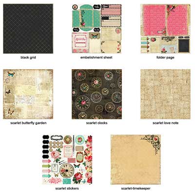
I used the masculine patterns from the Scarlet collection to create this digi layout. To make the layout more masculine, I focused on a monochromatic color scheme. Below are the patterns that I used......

In the Scarlet-Timekeeper paper I wanted to use the clocks and gears as a frame around the photograph, but the flower was too feminine. I decided to cover it with one of the clocks from the Scarlet-Clock paper.
I converted the Scarlet-folder page to black and white then inverted the image to give me a darker more edgy file folder for contrast against the layers of patterned paper. Then I cropped only the edge of the folder to use on my layout. You can see it poking out behind the gears in the above photo.
To create my washi tape - I used the Scarlet-LoveNote paper. To make it dark, I followed the same steps as the file folder. Then changed the color to a rich brown so that it would have contrast, but not be too distracting. I then used a mask to give it a torn look.
I love to use things in an unexpected way. This collection has a very feminine vibe. By being selective with which portions I took from the collection, I was able to create a very masculine project.
Thanks for stopping in today.
Tonya A. Gibbs


No comments:
Post a Comment